SAMO Viewer
From version Dynamic App 10.5.0
samo-viewer renders entity data as a filterable, sortable list (table, card list, or tiles) alongside a map and detail panel. It replaces samo-browse, providing a modernized user experience and a more flexible configuration model.
What you can build:
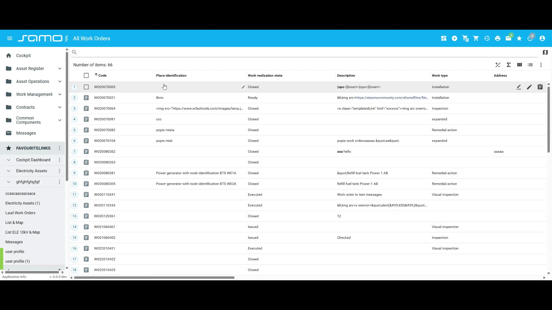
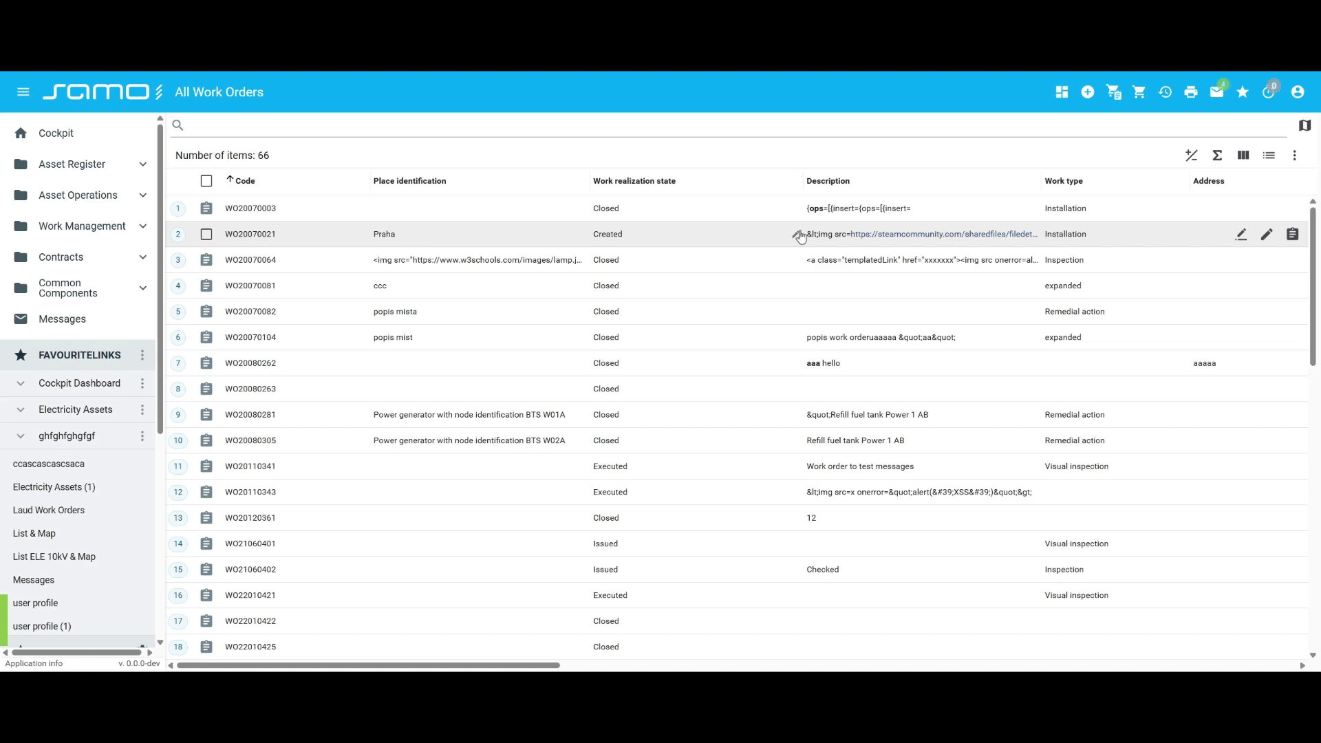
- Filterable, paginated entity tables with column reordering and resizing
- Side-by-side split-panel layouts combining list, map, and detail
- Inline cell or row editing with role-based permission control
- Saved named views per user or shared across the team
- Export to Excel from any list view
What's New Compared to samo-browse
| Feature | samo-browse | samo-viewer | |
|---|---|---|---|
| Pagination | Improved | Infinite scroll only | Full pagination controls with page size selector and direct page input |
| Column reorder & resize | New | Not supported | Drag to reorder, drag border to resize; state persisted in URL |
| Sorting | Improved | Single-column only | Multi-column sort (Shift+Click), remove sort (Ctrl+Click), mobile sort via long-press dialog |
| Inline cell editing | Improved | inPlaceEdit | Edit individual cells in place without opening a dialog |
| Inline row editing | New | Not supported | Edit an entire row inline without opening a dialog |
| Map in dynamic window | New | Not supported | Map can be popped out into a floating window, synchronized with the list |
| Layout picker | New | Fixed drawer layout | Split-panel layout with user-configurable panel visibility and sizing |
| Data source | Improved | Elasticsearch only | FeatureAPI (recommended) or Elasticsearch; configuration unified under dataSource |
Quick Start
The minimum viable configuration requires only type:
{
	"type": "component:entity-modules/viewer/samo-viewer",
	"entitiesGroup": "myEntities"
}
What you get by default:
- Split-panel layout (
layout.mode: "default") - Table view with card list and tiles switcher available
- Pagination: 50 items per page, per-page dropdown, direct page-number input
- All three CRUD operations permitted (create, edit, delete)
- Export to Excel enabled
- Continuous action checkbox enabled (unchecked by default)
Merge behavior: Objects merge with defaults, but arrays replace entirely — no additive merging.
Data SourceImproved
The dataSource property determines which backend API the viewer uses. When omitted, featureApi is used by default. The choice gates several features.
FeatureAPI (type: "featureApi")
The recommended choice for new pages. Uses the SAMO Feature API.
FeatureAPI does not support: list.aggregations, nearbyFilter, or full-text search.
| Property | Type | Description |
|---|---|---|
dataSource.type | "featureApi" | Selects the FeatureAPI store. Default when dataSource is omitted. |
dataSource.query.filter | object | Global filter applied to all entity types. Always active — no filter chip shown. |
dataSource.query.types | object | Per-entity-type filter overrides. Keys are entity type identifiers. |
dataSource.sort | SortItem[] | Background sort. Not shown in column headers or URL. |
"dataSource": {
    "type": "featureApi",
    "query": {
        "filter": { "at_status": "active" },
        "types": {
            "ft_workOrder": { "filter": { "at_priority": 4 } }
        }
    },
    "sort": [
        { "property": "at_createdAt", "order": "desc" }
    ]
}
Elasticsearch (type: "elastic")
Legacy data source from samo-browse. Use when you need aggregations, the nearby filter, or by-path related searches. New pages should prefer featureApi.
| Property | Type | Description |
|---|---|---|
dataSource.type | "elastic" | Selects the Elasticsearch store. |
dataSource.query.must | object | object[] | must clause(s) added to every search request. |
dataSource.query.mustNot | object | object[] | must_not clause(s). |
dataSource.query.entryPoint | object | EntryPoint for by-path related search. |
dataSource.query.path | array | Path array for by-path related search. |
dataSource.sort | SortItem[] | Background sort. Not shown in column headers or URL. |
Sort Items
Both sources use the same sort item shape:
{ "property": "at_name", "order": "asc" }
dataSource.sort is a background sort — it is always applied but never shown in column headers, sort indicators, or the URL. Users cannot see or change it.
String attributes in Elasticsearch require the .sort postfix on the property name: use "at_name.sort" instead of "at_name".
Layout
The layout.mode property controls the overall page structure.
The default mode is "default" (split-panel layout). Set "legacy" only when migrating pages that depend on the old samo-browse layout.
Default Mode — Layout PickerNew
The split-panel layout is active by default. A layout picker button is added to the app toolbar, letting users drag-resize and toggle which panels (list, map, detail) are visible side-by-side.
Click the layout picker button in the toolbar to show/hide panels and drag the dividers between them to resize.
| Property | Type | Default | Description |
|---|---|---|---|
layout.mode | "default" | "legacy" | "default" | Layout mode. Set to "legacy" for the old samo-browse drawer layout. |
Mobile Layout
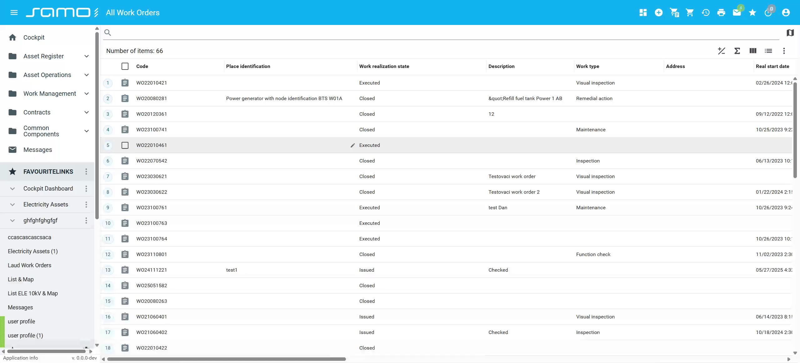
On small viewports the viewer automatically stacks panels vertically, regardless of layout.mode. No configuration is needed.
On mobile devices, panels stack vertically in a scrollable view instead of side-by-side.
Layout Persistence
The viewer remembers each user's layout — which panels are open and how they are sized. When a user returns to the page, everything looks exactly as they left it. No configuration needed.
Legacy Mode
layout.mode: "legacy" reproduces the old samo-browse drawer-based layout. Use this only when migrating pages that depend on the old layout behavior. New pages should omit layout.mode entirely (defaults to "default").
List Configuration
All list-specific options live under the list key.
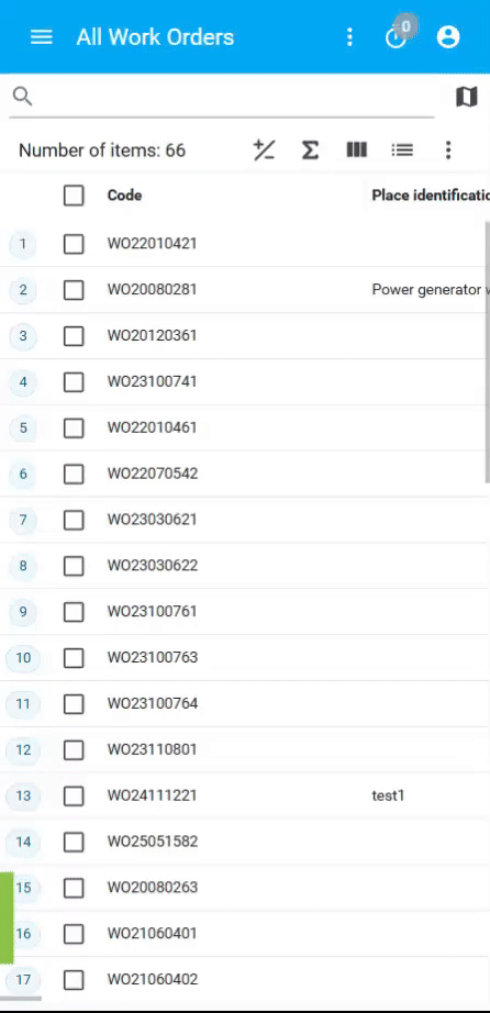
Display Views
Three view types are available. list.activeView sets the view on first load; list.views controls which switcher buttons appear in the toolbar.
| Property | Type | Default | Description |
|---|---|---|---|
list.activeView | "table" | "list" | "tiles" | "table" | View on first load. |
list.views | array | ["table", "list", "tiles"] | Views the user can switch between. |
"table"— spreadsheet-style rows and columns"list"— list"tiles"— image-based tiles
To lock the viewer to a single view, set both properties to the same single-item array:
"list": {
    "activeView": "tiles",
    "views": ["tiles"]
}
ColumnsNew
list.defaultColumns defines which columns are shown on first load. If omitted, columns are derived from entity metadata.
Users can reorder columns by dragging and resize them by dragging column borders. Column state is reflected in the URL.
| Property | Type | Default | Description |
|---|---|---|---|
list.defaultColumns | string[] | (from metadata) | Initial column set, by property name. |
"list": {
    "defaultColumns": ["at_name", "at_status", "at_createdAt"]
}
Drag a column header left or right to reorder columns. Column order is preserved in the URL.
Double-click the border between two column headers to auto-fit the left column to its content width.
Double-click column auto-resize is only available when pagination is enabled. It is not supported in infinite scroll mode.
SortingImproved
Users interact with column headers to control sorting:
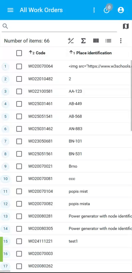
- Click a column header to sort by that column (ascending first, then descending on repeat clicks).
- Shift + Click a column header to add it to the sort as a secondary (or tertiary, etc.) sort key — multi-column sort.
- Ctrl + Click a column header to remove it from the sort.
Sort state is stored in the URL. A background sort can also be configured via dataSource.sort — it is invisible to the user and not reflected in column headers.
See the Data Source section for dataSource.sort configuration.
On mobile, sorting is applied through a column dialog that appears when long-pressing a column header.
Click a column header to sort ascending, click again to sort descending. Shift+Click to add secondary sort columns.
On mobile, long-press a column header to open the sort dialog for selecting columns and sort order.
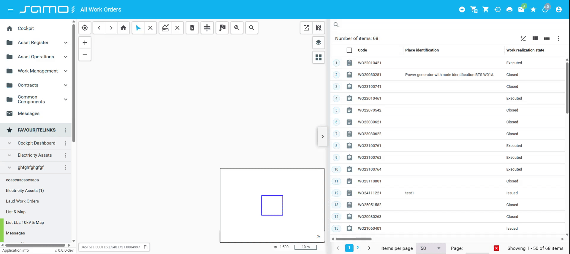
PaginationNew
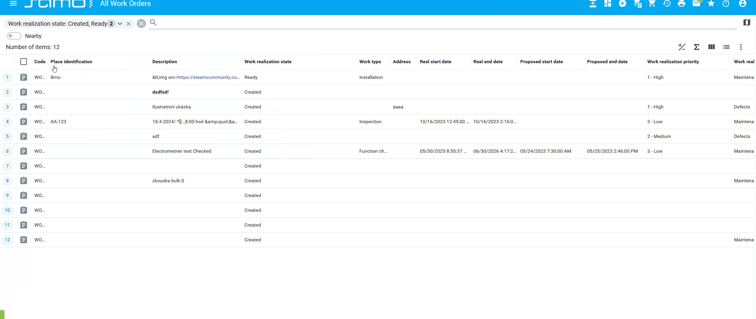
Pagination is enabled by default. Users see page navigation controls, can change the items per page, and jump directly to any page number. When pagination is disabled (list.pagination.enabled: false), the list switches to infinite scrolling — new items load automatically as the user scrolls down.
| Property | Type | Default | Description |
|---|---|---|---|
list.pagination.enabled | boolean | true | Enable pagination; false uses infinite scrolling. |
list.pagination.itemsPerPage | number | 50 | Items loaded per page. |
list.pagination.itemsPerPageOptions | number[] | [10, 20, 50, 100] | Options in the per-page dropdown. Replaces defaults wholesale. |
"list": {
    "pagination": {
        "itemsPerPage": 25,
        "itemsPerPageOptions": [10, 25, 100],
    }
}
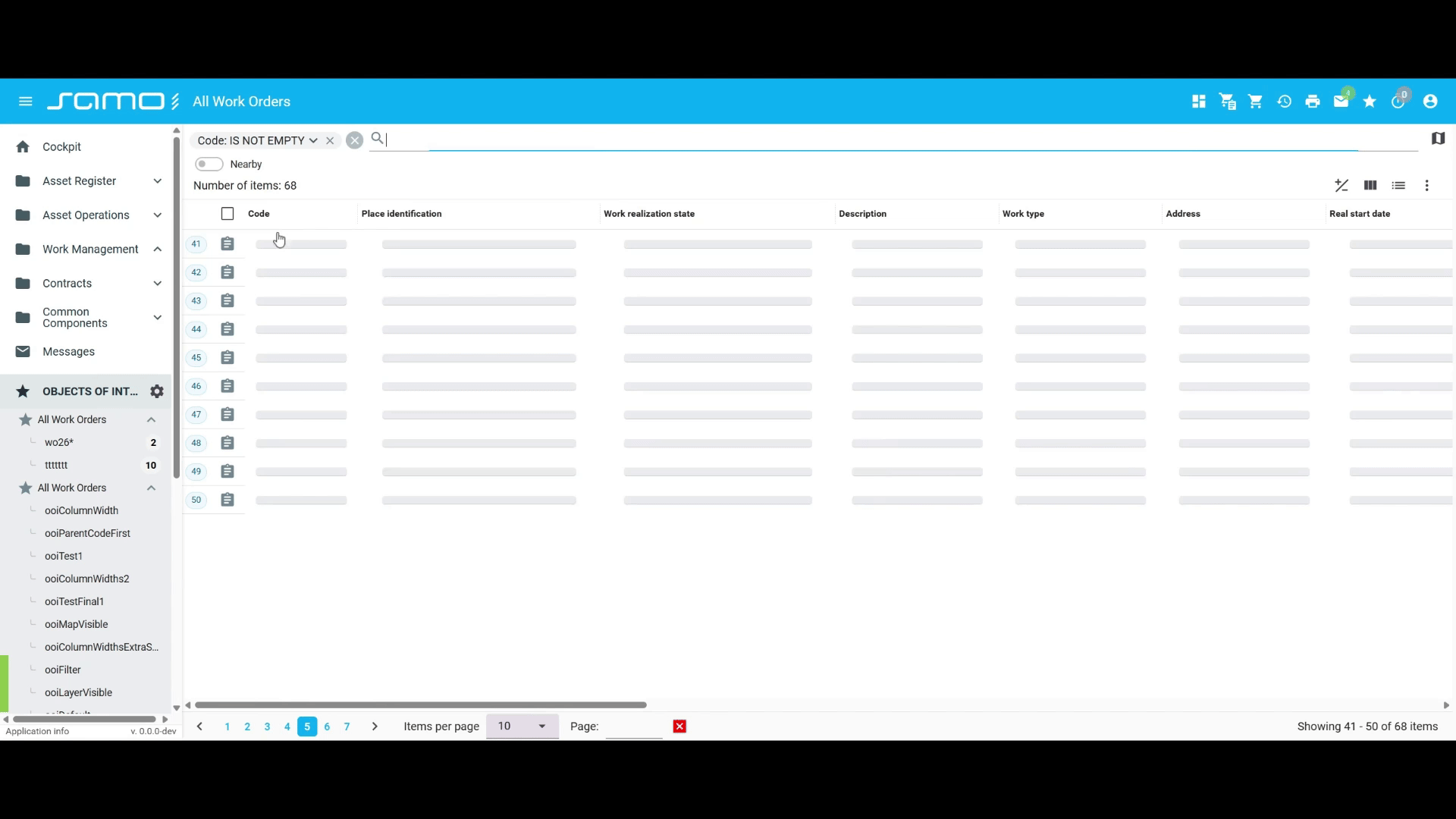
Navigation controls at the bottom show current page, allow jumping to a specific page, and let users select items per page from a dropdown.
Inline EditingNew
Two inline editing modes are available. Both are only functional when permittedOperations.edit is true (the default).
| Property | Type | Default | Description |
|---|---|---|---|
list.cellEdit.enabled | boolean | false | Enable single-cell inline editing. |
list.rowEdit.enabled | boolean | false | Enable whole-row inline editing. |
- Cell edit: clicking a cell opens an in-place editor for that cell only.
- Row edit: an edit icon appears per row; clicking opens the entire row for editing inline.
Configuration dynamicOnChange or prepareDataContext are not supported!
"list": {
    "cellEdit": { "enabled": true }
}
Click on a cell to open an inline editor for that single field.
Click the edit icon on a row to open the entire row for inline editing with all fields editable at once.
Multi-Select and Row Coloring
| Property | Type | Default | Description |
|---|---|---|---|
list.multiSelectEnabled | boolean | true | Enable row checkboxes for multi-selection. |
list.coloringEnabled | boolean | false | Show entity color as a colored left border on each row. |
Export
An export-to-Excel button appears in the toolbar by default.
| Property | Type | Default | Description |
|---|---|---|---|
list.export.enabled | boolean | true | Show the export button. |
list.export.title | boolean | true | Show a title input field in the export dialog. |
Aggregations
Elasticsearch only: list.aggregations is not supported with dataSource.type: "featureApi".
An aggregation row (sum) can be displayed in the table footer. Users can toggle its visibility. By default it covers all numeric columns; use columns to restrict which ones.
| Property | Type | Default | Description |
|---|---|---|---|
list.aggregations.enabled | boolean | false | Show the aggregation row. |
list.aggregations.columns | string[] | (all numeric) | Column property IDs to aggregate. |
list.aggregations.visible | boolean | true | Show the aggregation row by default (user can toggle). |
"list": {
    "aggregations": {
        "enabled": true,
        "columns": ["at_cost", "at_duration"],
        "visible": true
    }
}
Map in Dynamic WindowNew
The map toolbar includes a pop-out button that opens the map in a separate floating window, synchronized with the list in real time.
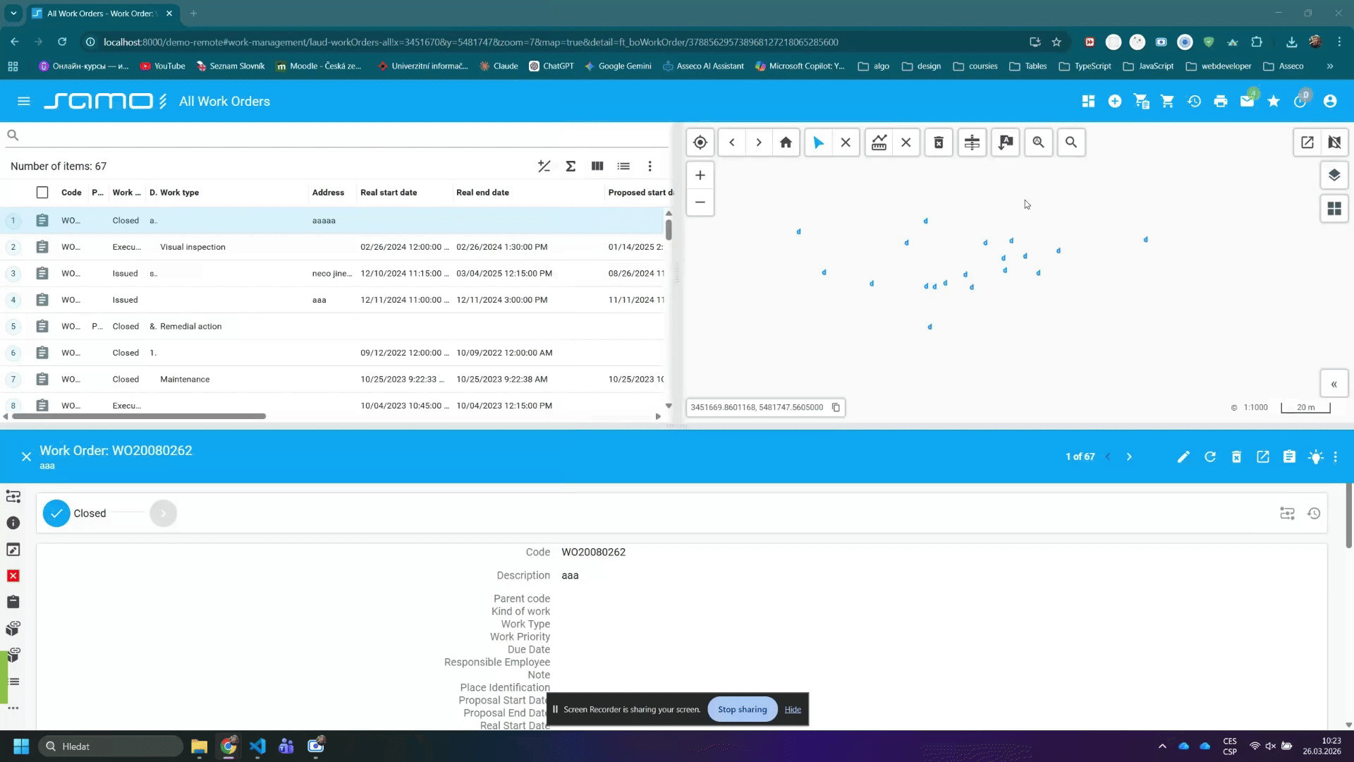
Click the pop-out button in the map toolbar to open the map in a floating window. The floating map stays synchronized with list selections.
For the full map configuration reference, see samo-viewer configuration.
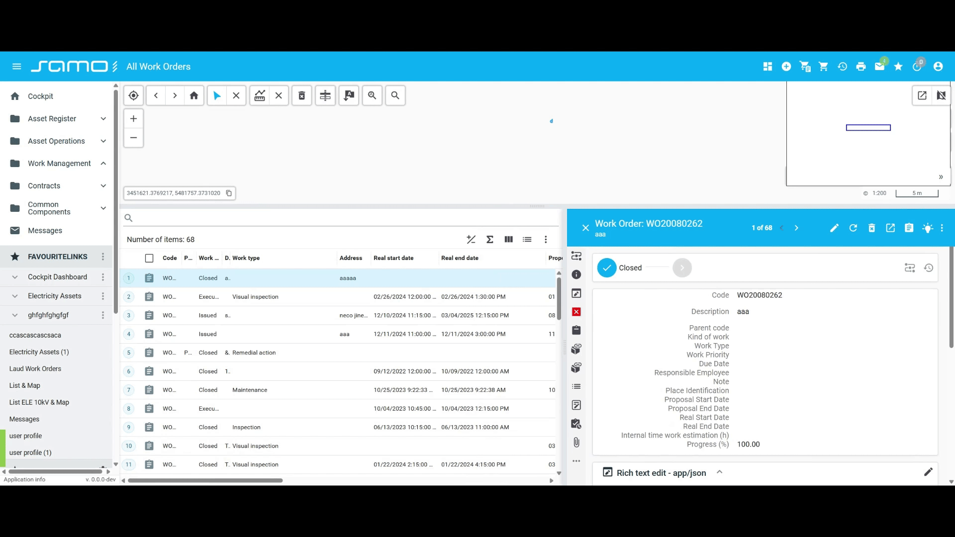
Detail Panel
Clicking a row opens an entity detail panel. The context (form layout) is configured with detail.defaultContext. Separate contexts can be provided for view, edit, create, and print modes.
Context values support template strings evaluated against entity data, e.g. "workOrder-detail-{at_type}".
| Property | Type | Default | Description |
|---|---|---|---|
detail.defaultContext | string (templated) | — | Context for the view-mode detail. |
detail.editContext | string (templated) | — | Context for edit mode; falls back to defaultContext. |
detail.createContext | string (templated) | — | Context for create mode; falls back to editContext, then defaultContext. |
detail.printContext | string (templated) | — | Context for print preview; falls back to defaultContext. |
detail.printPreviewEnabled | boolean | false | Show a print button in detail. Opens a preview dialog. |
detail.permittedOperations.edit | boolean | string | true | Override edit permission for the detail panel only. |
detail.permittedOperations.delete | boolean | string | true | Override delete permission for the detail panel only. |
detail.permittedOperations overrides the top-level permittedOperations for the detail panel only — use this when list and detail should have different permissions.
"detail": {
    "defaultContext": "workOrderDetail",
    "editContext": "workOrderEdit",
    "printPreviewEnabled": true,
    "permittedOperations": {
        "delete": false
    }
}
Search and Filtering
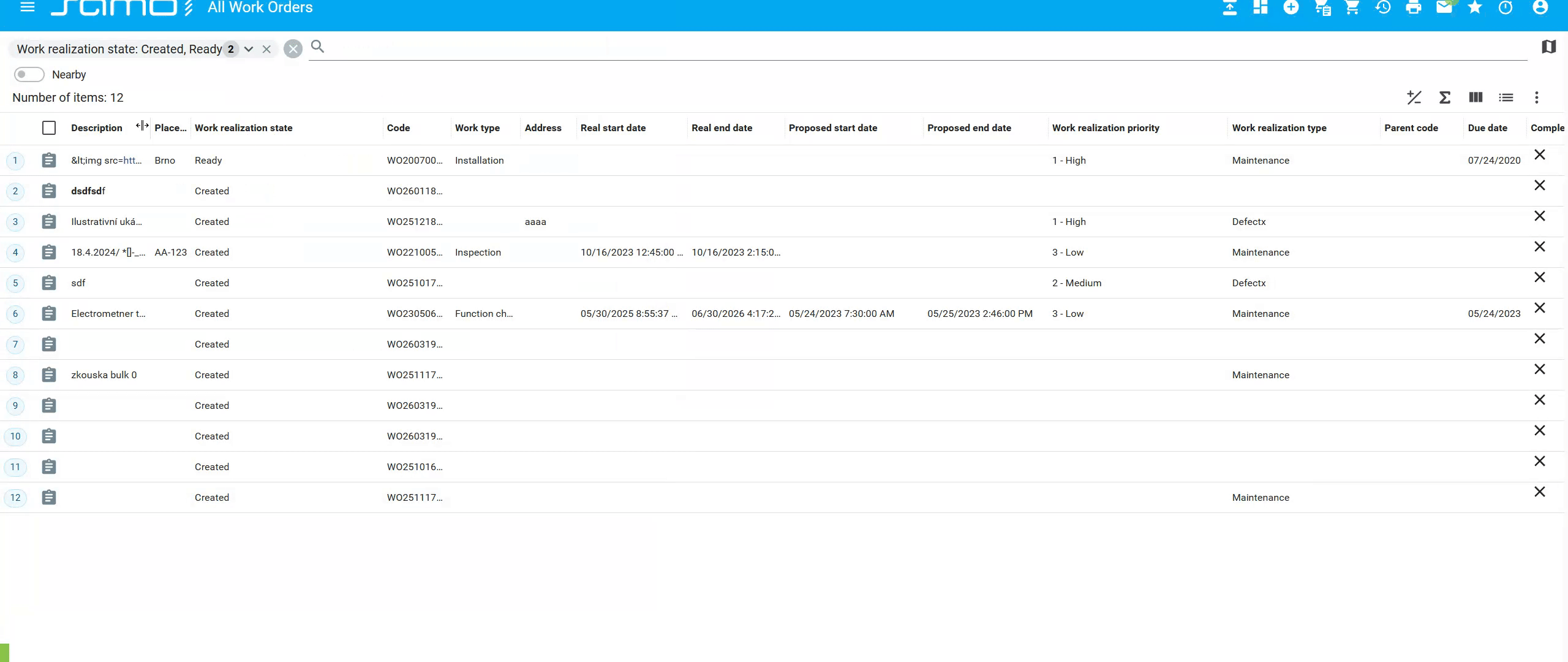
Basic Search Bar
The search bar builds suggestions from entity metadata.
| Property | Type | Default | Description |
|---|---|---|---|
filter.defaultQuery | string | — | Initial search query. Shown as a filter chip; user can change or clear it. |
filter.hiddenProperties | string[] | — | Properties to hide from search suggestions. |
filter.additionalProperties | string[] | — | Extra properties to add to search suggestions. |
filter.frequentlyUsedProperties | string[] | — | Properties pinned to the top of suggestions (order preserved). |
For related-entity attributes in hiddenProperties, the full path string is required, e.g.:
"as_*/ft_boCnsAsset/as_boCnsAss_boConstruction/ft_boConstruction.at_boBaseAct__startDate"
Advanced Filter
When enabled, adds a multi-term OR search mode.
| Property | Type | Default | Description |
|---|---|---|---|
advancedFilter.enabled | boolean | false | Enable multi-term OR filter. |
advancedFilter.defaultQuery | string | — | Initial advanced filter terms; user can change. |
Nearby Filter
Elasticsearch only: nearbyFilter is not supported with dataSource.type: "featureApi".
| Property | Type | Default | Description |
|---|---|---|---|
nearbyFilter.enabled | boolean | false | Enable geolocation-based proximity filter. |
Permissions
Every permission field accepts a boolean or a template string evaluated at runtime against the entity/data context. Example: "{isEqual:#at_status,draft}" evaluates to true when at_status equals "draft".
permittedOperations controls the top-level Create button and default edit/delete access in both the list and the detail panel.
| Property | Type | Default | Description |
|---|---|---|---|
permittedOperations.create | boolean | string | true | Show the Create button in the toolbar. |
permittedOperations.edit | boolean | string | true | Allow editing in list and detail. |
permittedOperations.delete | boolean | string | true | Allow deletion in list and detail. |
detail.permittedOperations (see Detail Panel) overrides these values specifically for the detail panel.
"permittedOperations": {
    "create": true,
    "edit": "{isEqual:#at_status,draft}",
    "delete": false
}
Entity Creation (Insert)
By default, the Create button derives available entity types from entitiesGroup and the current user's rights. The insert key lets you customize or extend this.
Set insert.defaultInsertEnabled: false to suppress the auto-derived options and use only custom entries.
insert.entities adds custom entries to the Create dropdown. Two variants are supported:
Standard creation — opens a detail context form:
| Property | Type | Required | Description |
|---|---|---|---|
entity | string | yes | Entity type to create. |
title | string (templated) | yes | Label in the Create dropdown. |
icon | string (templated) | no | Icon in the Create dropdown. |
detailContext | string | no | Context name for the create form. |
dataContext | object | no | Pre-filled field values. |
insertDataContextAction | object | no | Action executed before the form opens; response fills dataContext. |
forcePageReloadOnCreate | boolean | no | Reload the full page after creation. |
waitOnIndex | boolean | no | Wait for server indexing before responding. Increases latency — use sparingly. |
Business-action creation — triggers a business action instead of a form:
| Property | Type | Required | Description |
|---|---|---|---|
entity | string | yes | Entity type. |
title | string (templated) | yes | Label in the Create dropdown. |
type | "business-action" | yes | Required to select this variant. |
actionId | string | yes | ID of the business action to execute. |
icon | string (templated) | no | Icon in the Create dropdown. |
dataContext | object | no | Pre-filled field values passed to the action. |
insertDataContextAction | object | no | Action executed before the business action; response fills dataContext. |
navigateAfterFinish | object | no | Navigate to a page after the action completes. part, page, and arguments support template strings from the action response. |
forcePageReloadOnCreate | boolean | no | Reload the full page after creation. |
waitOnIndex | boolean | no | Wait for server indexing. Increases latency — use sparingly. |
"insert": {
    "defaultInsertEnabled": false,
    "entities": [
        {
            "entity": "ft_workOrder",
            "title": "New Work Order",
            "icon": "samo-icons:work-order",
            "detailContext": "workOrderCreate",
            "dataContext": { "at_status": "draft" }
        },
        {
            "entity": "ft_workOrder",
            "title": "Create via Workflow",
            "type": "business-action",
            "actionId": "createWorkOrderAction",
            "navigateAfterFinish": {
                "part": "workOrders",
                "page": "detail",
                "arguments": { "id": "{response.id}" }
            }
        }
    ]
}
Saved Views
The views manager lets users save and restore combinations of search query, filter, sort, column selection, and display type. Views can be private to the user, shared across the team, or pre-defined as static views in configuration.
views.id is required, it must be unique across the entire application — duplicate IDs cause views to be mixed between unrelated pages.
| Property | Type | Default | Description |
|---|---|---|---|
views.id | string | — | Required. Unique viewer identifier across the whole app. |
views.enabled | boolean | false | Enable the views manager. |
views.shared.permittedOperations | object | — | Permissions for shared views (create, edit, delete). |
views.user.permittedOperations | object | — | Permissions for user-private views. |
views.static | array | — | Predefined static views. |
Each views.static item has a description (menu label) and a value object capturing view state. All fields in value are optional strings matching the URL parameter format.
"views": {
    "id": "workOrdersPage",
    "enabled": true,
    "static": [
        {
            "description": "Active, sorted by priority",
            "value": {
                "search": "at_status:active",
                "sort": "at_priority,asc",
                "view": "table"
            }
        }
    ]
}
Continuous Action
Adds a "Create another" / "Edit next" checkbox to create and edit dialogs. When checked, the dialog stays open after saving for the next operation.
| Property | Type | Default | Description |
|---|---|---|---|
continuousAction.enabled | boolean | true | Show the continuous action checkbox. |
continuousAction.checked | boolean | false | Pre-check the checkbox when the dialog opens. |