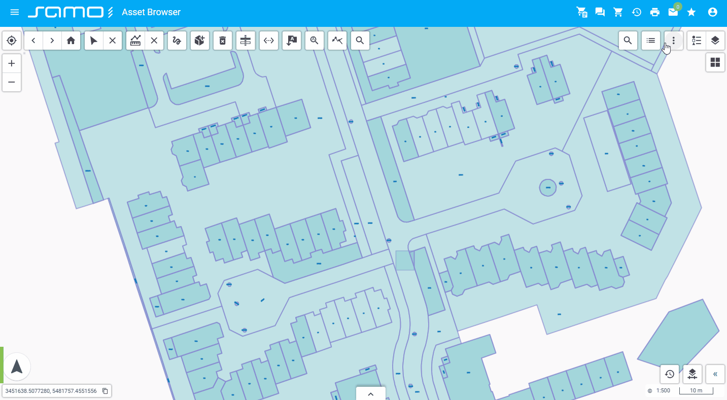
Toolbars
Configuration for toolbars is located in separate json files under the following folder structure:
dynamic-app
│
└───samo-demo\configuration
    │
    └───map
        │
        └───toolbars
        |    └───search-forms
        │    |   └───mainPipelineAddress.json
        |    |   └───note.json
        |    └───default-toolbar.json
        └───default.json
Default toolbar
{
"layersControl":{
"type": "sm-layers-control",
"externalContainer": true, // content will be displayed in right drawer
"addLayersConfiguration": {
"tabs": [
{"type": "sm-set-definition-tree"}
{"type": "sm-layers-from-filter", "entitiesGroup": "_all"}, //configure entities group for selecting featuretypes
{ "type": "sm-layers-from-file" }
]
}
},
"backdropsControl":{
"type": "backdrops-control",
"externalContainer": true // content will be displayed in right drawer
},
"geolocation":{
"type": "sm-geolocation"
},
"zoomControl":{
"type": "sm-zoom-control"
},
"navigationHistory":{
"type": "sm-navigation-history"
},
"select":{
"type": "sm-select"
},
"measurement":{
"type": "sm-measurement"
},
"print":{
"type": "sm-print"
},
}
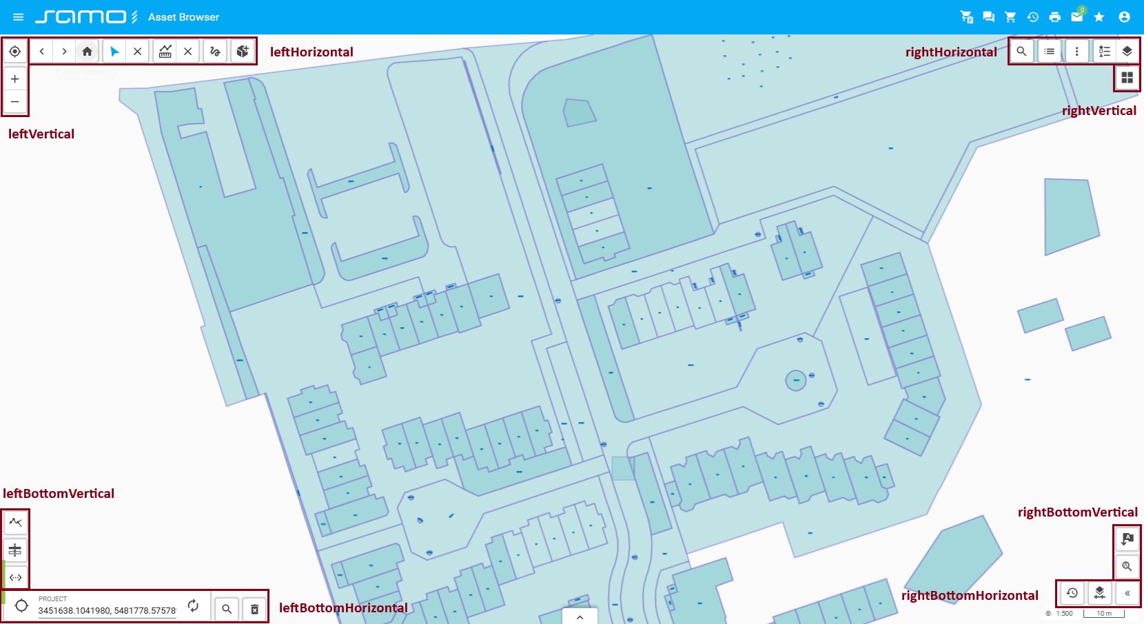
| Position | Tools |
|---|---|
| leftVertical | sm-geolocation, sm-zoom-control |
| leftHorizontal | sm-navigation-history, sm-select, sm-measurement |
| rightVertical | sm-backdrops-control, sm-print |
| rightHorizontal | sm-layers-control |
| leftBottomHorizontal | sm-coordinates |
The positions rightBottomHorizontal, leftBottomVertical, and rightBottomVertical are empty by default.
Extending toolbars with custom tools
{
"layout":{
"rightHorizontal": {
"extendItems": ["searchForm"] // add searchForm to rightHorizontal toolbar
},
"leftHorizontal": {
"extendItems": ["newFeatures"] // add newFeatures to leftHorizontal toolbar
},
"rightVertical": {}, // tools displayed vertically on the right side
"leftVertical": {}, // tools displayed vertically on the left side
"leftBottomHorizontal": {}, // tools displayed horizontally at the bottom left
"rightBottomHorizontal": {}, // tools displayed horizontally at the bottom right
"leftBottomVertical": {}, // tools displayed vertically at the bottom left
"rightBottomVertical": {} // tools displayed vertically at the bottom right
},
"configuration":{
"searchForm":{ // define what does "searchForm" from layout configuration means
"type": "sm-search-form",
"icon": "samo-icons:list",
"searchForms":["note", "mainPipelineAddress"]
},
"newFeatures":{ // define what does "newFeatures" from layout configuration means
"type": "sm-new-feature",
"featureTypes": ["ft_5081000"],
"layers": ["my-sketchings"]
}
}
}
Tools
Archive Date
sm-archive-date: Manages or displays archived data by date.
"archiveDate": {
  "type": "sm-archive-date",
  "id": "archiveDate"
}
Show sample animation "Archive Date"
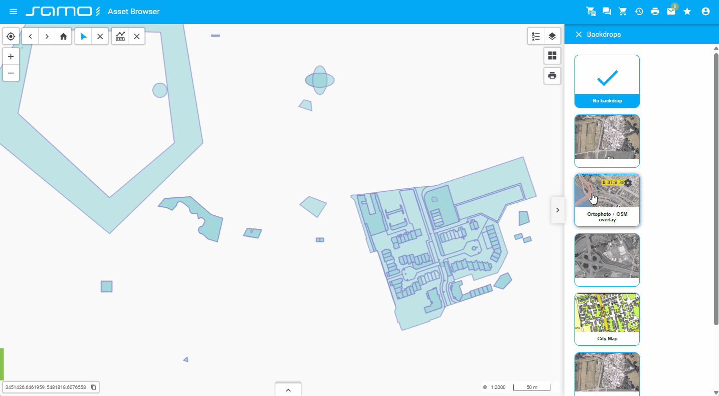
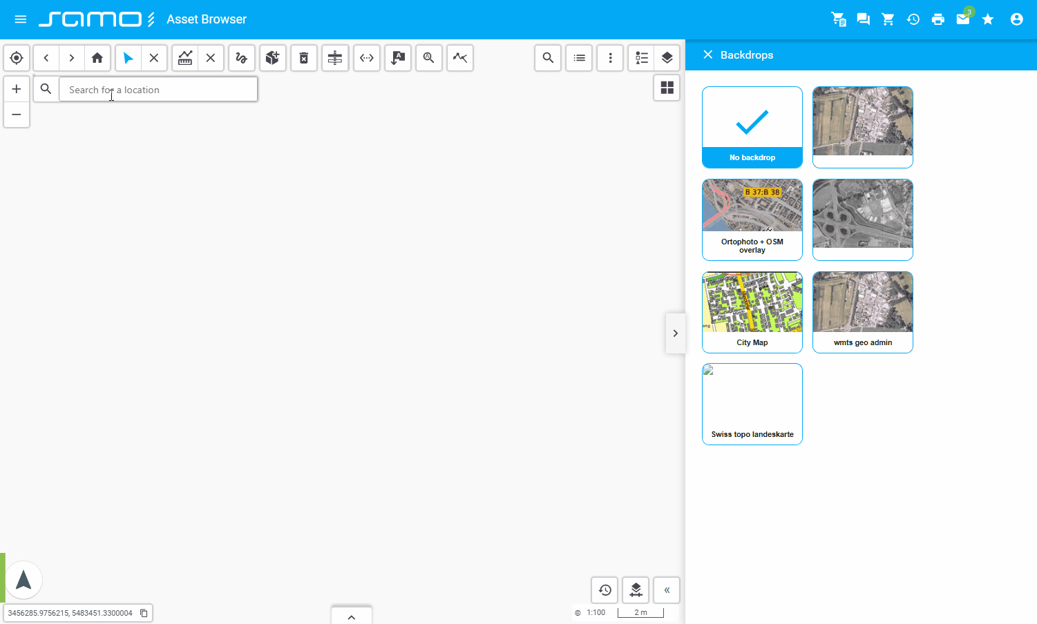
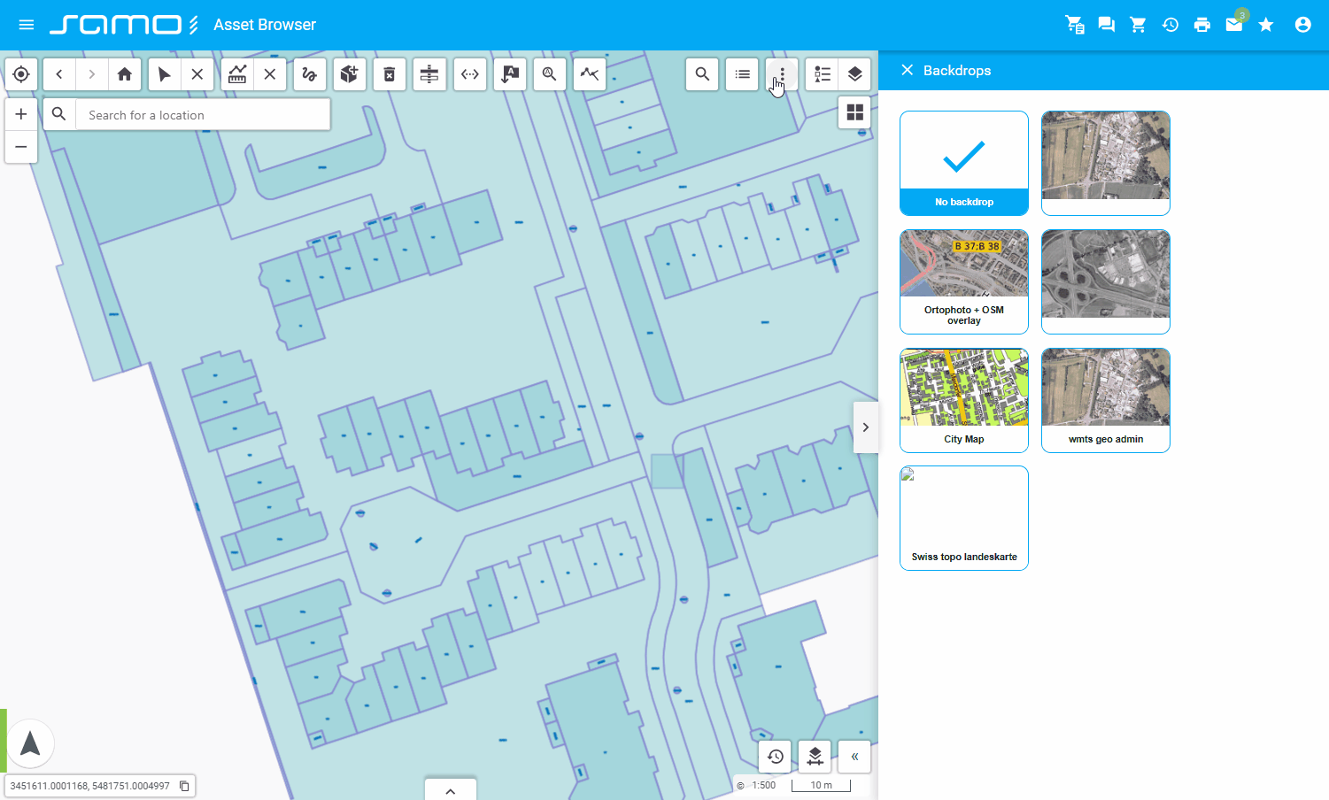
Backdrops control
sm-backdrops-control: Manages and switches between backdrop (background) map layers such as orthophoto, base maps, or other tile layers.
"backdropsControl": {
  "type": "sm-backdrops-control",
  "externalContainer": true,
  "id": "backdropsControl"
}
Show sample animation "Backdrops control"
Button (Group)
sm-group: Implements custom button controls for grouping multiple tools in the toolbar.
Allowed tool types in group:
- sm-print
- sm-lps-print
- sm-plot-layout-print
- sm-geolocation
- sm-backdrops-control
- sm-cross-section
Other tool types will be ignored if added to the group items array.
"group": {
  "type": "sm-group",
  "items": [
    {
      "type": "sm-print",
      "id": "print",
      "tooltip": "Simple print"
    },
    {
      "type": "sm-plot-layout-print",
      "id": "plotLayoutPrint",
      "tooltip": "Plot layout print"
    }
  ]
}
Show sample animation "Group"
Coordinates
sm-coordinates: Displays or manages map coordinates.
"coordinates": {
    "type": "sm-coordinates",
    "id": "coordinates",
}
Show sample animation "Coordinates"
Cross Section
sm-cross-section: Allows users to create and view cross-sections of map data.
"crossSection": {
  "type": "sm-cross-section"
}
Show sample animation "Cross section"
Delete Feature
sm-delete-feature: Allows deletion of selected map features.
"deleteFeature": {
  "type": "sm-delete-feature",
  "id": "deleteFeature"
}
Show sample animation "Delete feature"
Error Reporting
sm-error-reporting: Provides tools for reporting errors or issues within the map application.
"error-reporting": {
    "type": "sm-error-reporting",
    "id": "errorReporting",
    "action": {
            "serviceGroup": "layer-information",
            "service": "info-service",
            "actionId": "LayerInformationInMarkdown",
            "waitOnIndex": false
        }
},
Show sample animation "Error reporting"
Geolocation
sm-geolocation: Locates and displays the user's current position on the map using the browser's geolocation API.
"geolocation": {
  "type": "sm-geolocation",
  "id": "geolocation"
}
Show sample animation "Geolocation"
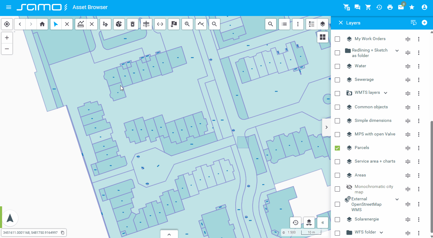
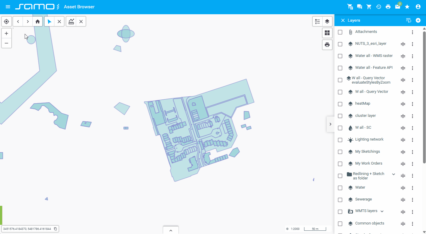
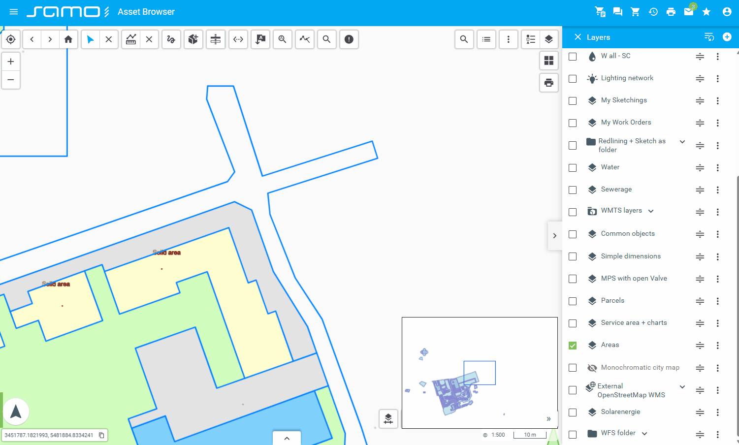
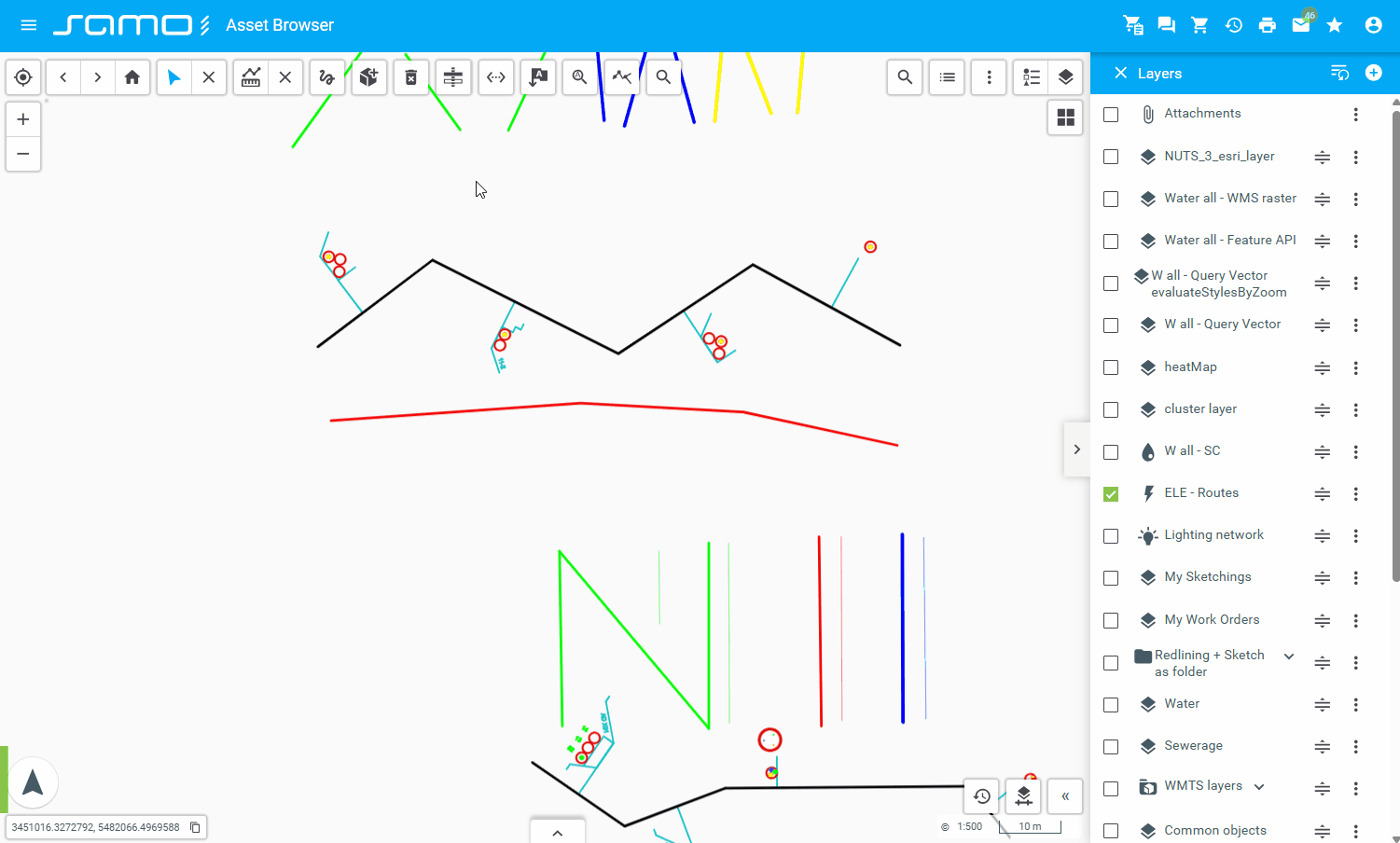
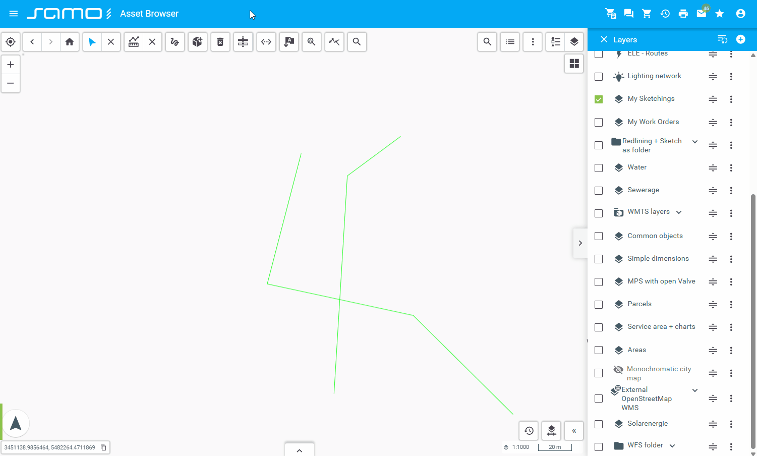
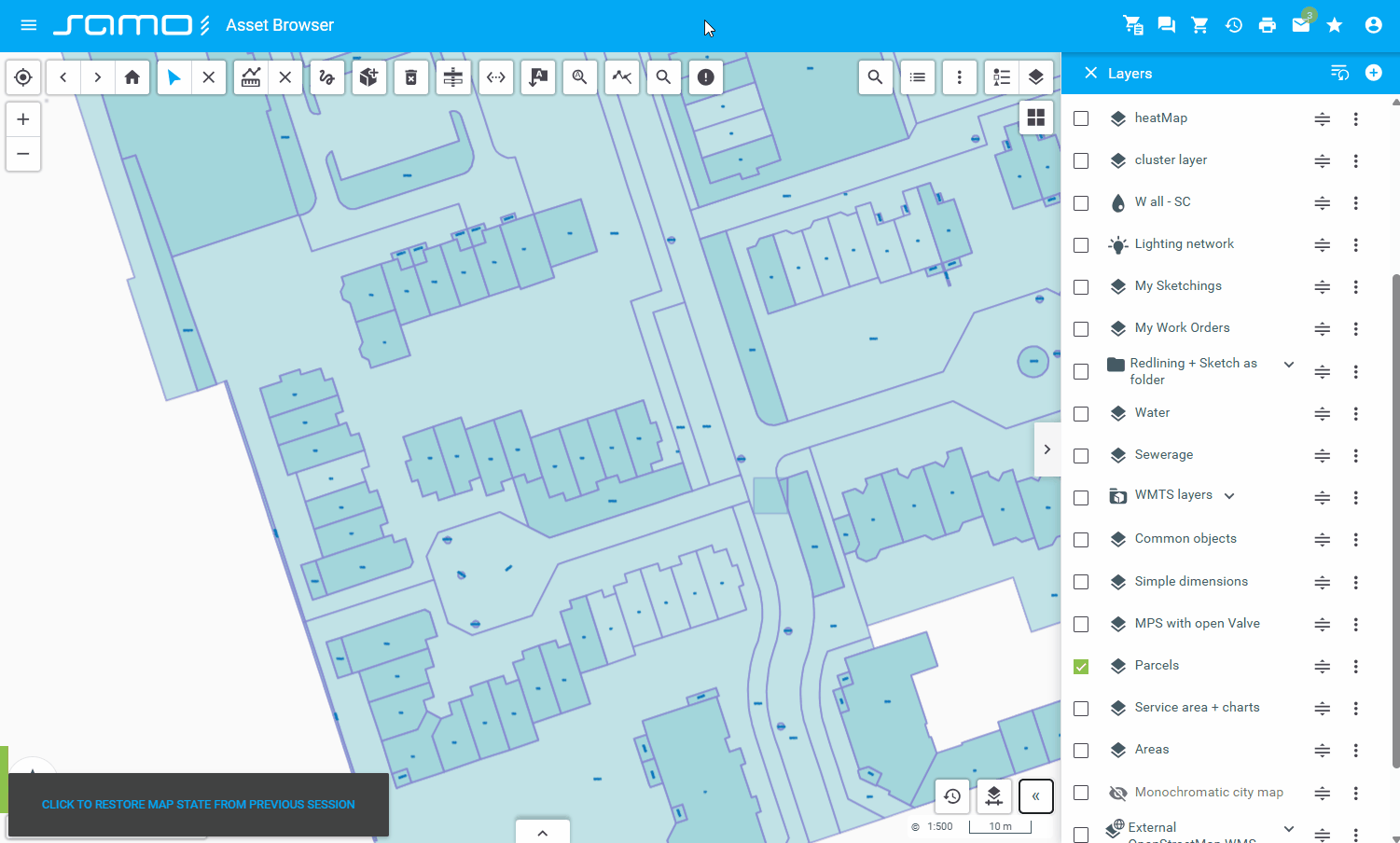
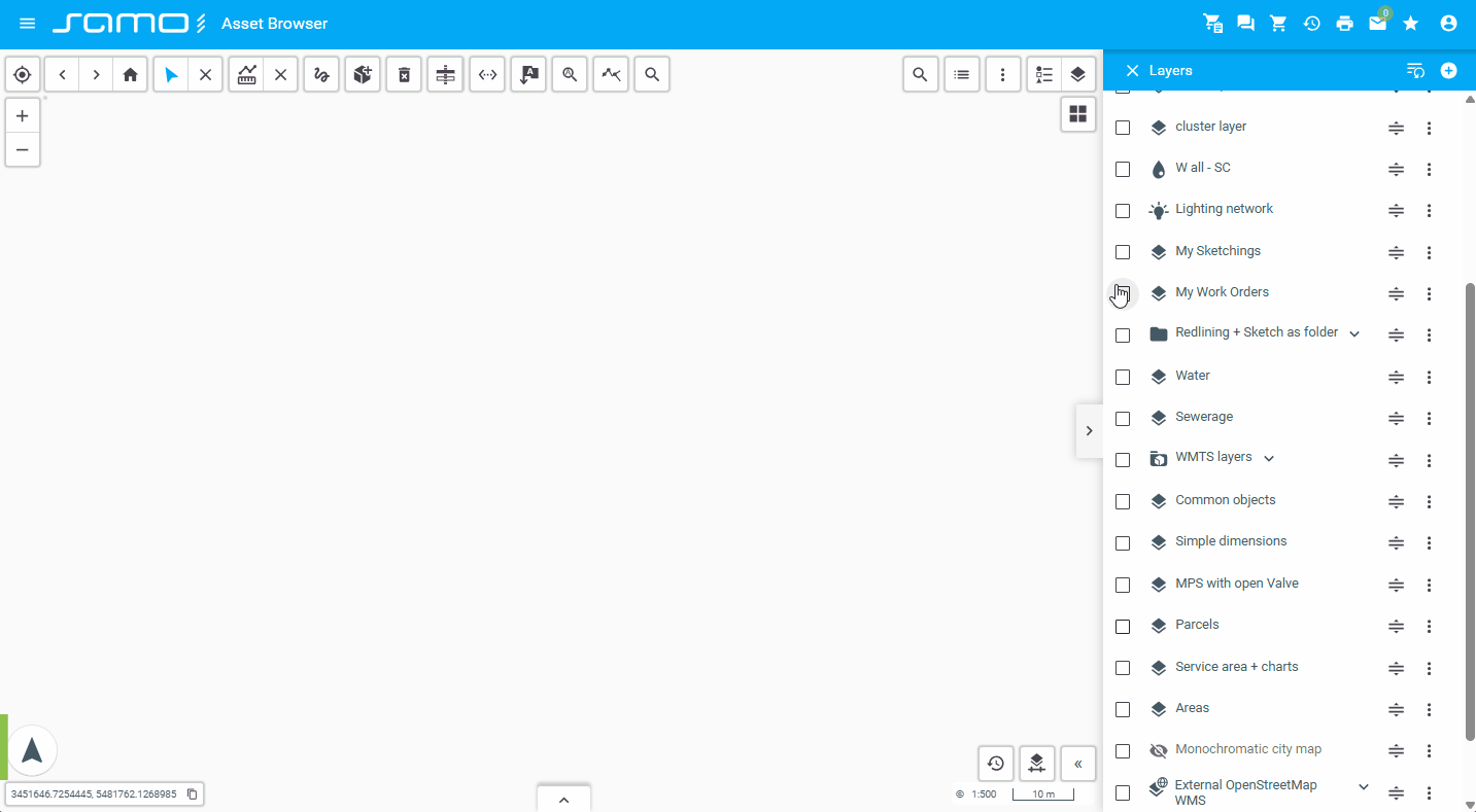
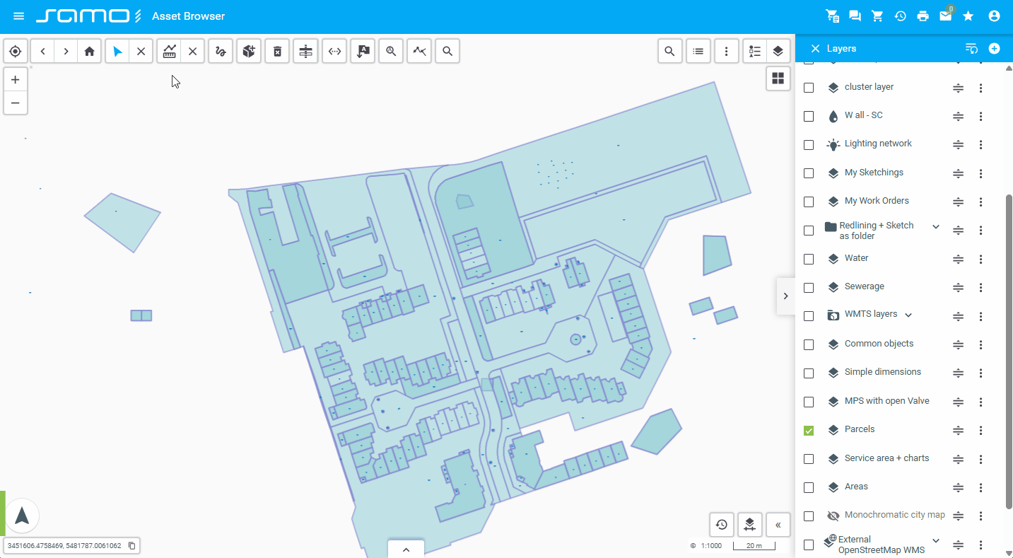
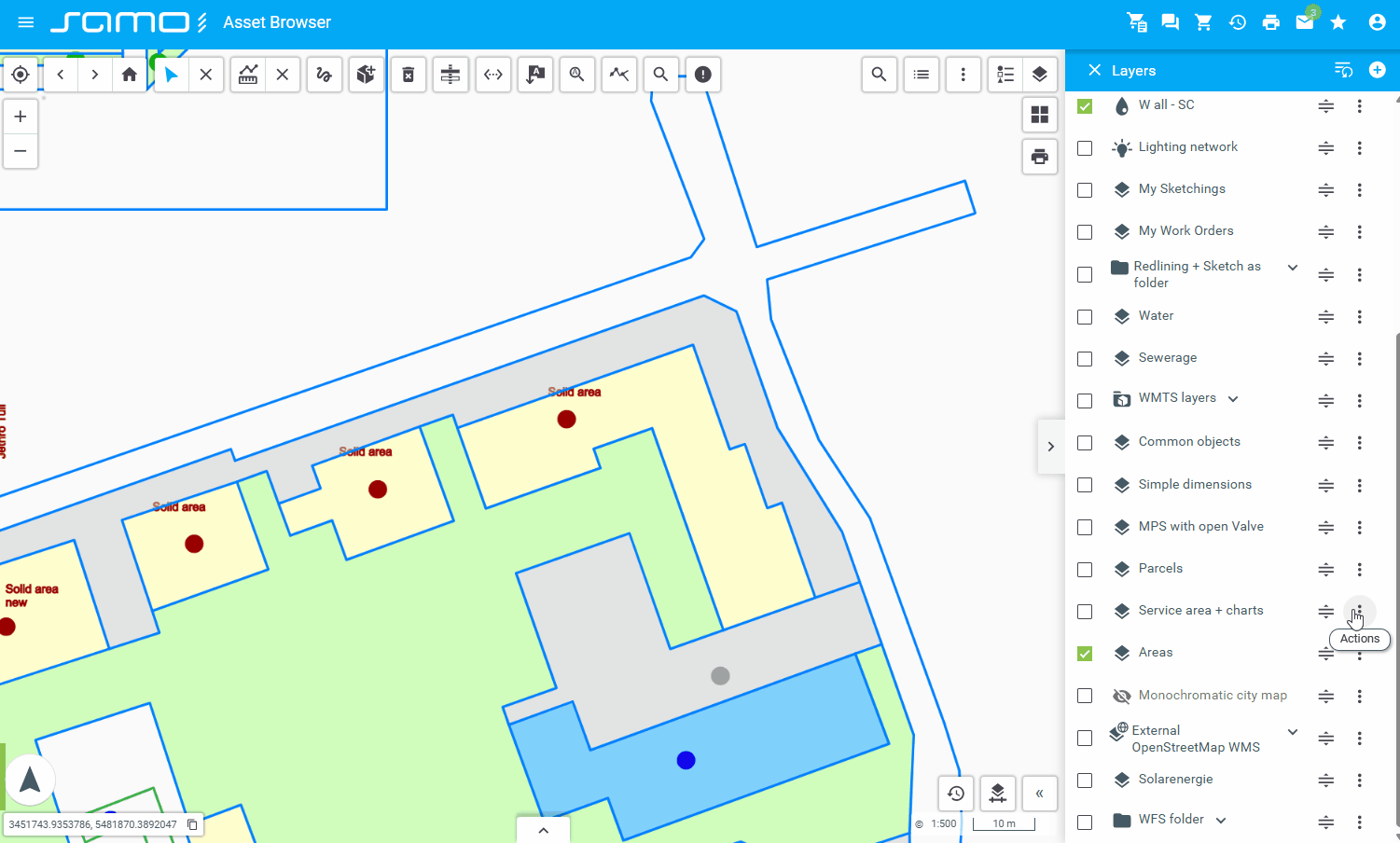
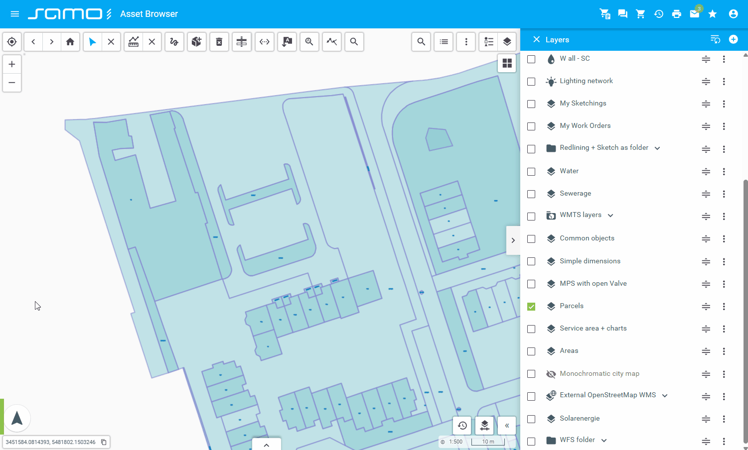
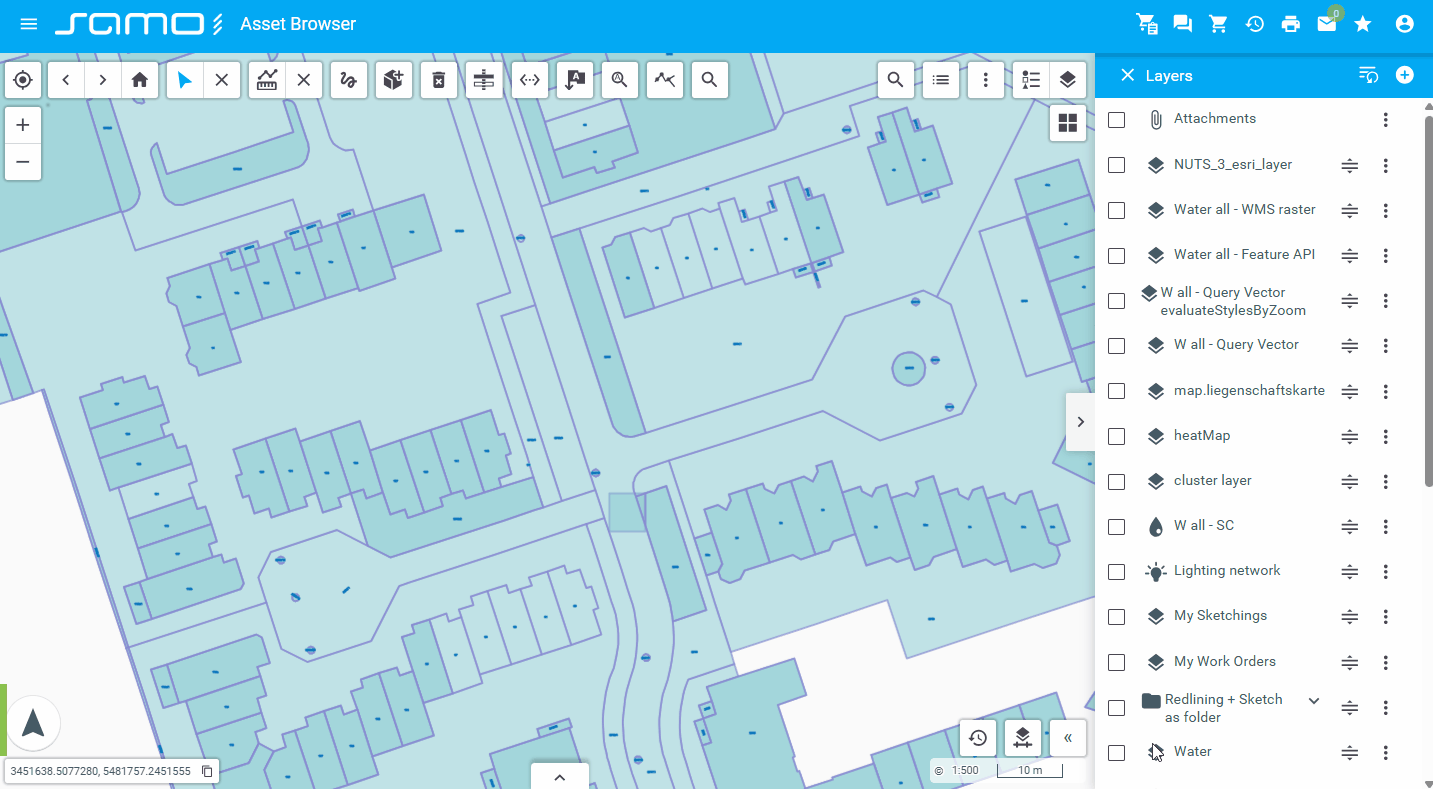
Layers Control
sm-layers-control: Manages map layers visibility, ordering, and configuration. Provides interface for adding layers from set definitions, filters, or files.
"layersControl": {
  "type": "sm-layers-control",
  "id": "layersControl",
  "externalContainer": true
}
Show sample animation "Layers control"
Locate Search
sm-locate-search: Locates and highlights search results on the map.
"locateSearch": {
  "type": "sm-locate-search",
  "id": "locateSearch",
  "providers": [
    {
      "providerName": "LIDS address points",
      "badge": {
        "enabled": true,
        "shortcut": "lids"
      },
      "maxItems": 5
    },
    {
      "providerName": "Swiss Topo",
      "badge": {
        "enabled": true,
        "shortcut": "swiss"
      },
      "maxItems": 5
    }
  ]
}
Show sample animation "Locate search"
LPS Print
sm-lps-print: Specialized printing functionality for LPS (Large Print System) format.
"print": {
  "type": "sm-lps-print",
  "serviceGroup": "lps",
  "service": "lps-service",
  "actions": {
    "createPlotTask": "createPlotTask",
    "getPlotTaskState": "getPlotTaskState",
    "getPlotFiles": "getPlotFiles"
  },
  "layouts": {
    "values": [
      {
        "id": "id_144216344535179744",
        "variables": [
          "Text2",
          {
            "AutorField": "{user:#firstName} {user:#lastName}"
          }
        ]
      },
      {
        "id": "id_144601173604901344",
        "variables": {
          "Text2": "ahoj ako sa mas: {get:#Text2}"
        },
        "additionalInfoModule": {
          "type": "component:dynamic-app/modules/forms/key-value-form",
          "elements": [
            {
              "label": "{tr:title}",
              "property": "text2"
            }
          ]
        }
      }
    ]
  }
}
Measurement
sm-measurement: Provides tools for measuring distances and areas on the map.
"measurement": {
  "type": "sm-measurement",
  "id": "measurement"
}
Show sample animation "Measurement"
Navigation history
sm-navigation-history: Provides back and forward navigation buttons to move through the history of map views (extent, zoom).
"navigationHistory": {
  "type": "sm-navigation-history",
  "id": "navigationHistory"
}
Show sample animation "Navigation history"

New Feature
sm-new-feature: Allows creating new features on the map.
"newFeatures":{
"type": "sm-new-feature",
"featureTypes": [
"ft_5081000",
"ft_5082000",
"ft_5083000"
],
"layers": [
"my-sketchings" //layers to turn on for sketching
]
}
Show sample animation "New feature"
Overview Map
sm-overview-map: Shows an overview or mini-map for context.
"overviewMap": {
  "type": "sm-overview-map",
  "layers": [
    {
      "id": "tms_orthophoto"
    }
  ],
  "width": 350,
  "height": 250,
  "color": "#0000FF",
  "collapsed": false,
  "collapsible": true
}
Show sample animation "Overview map"
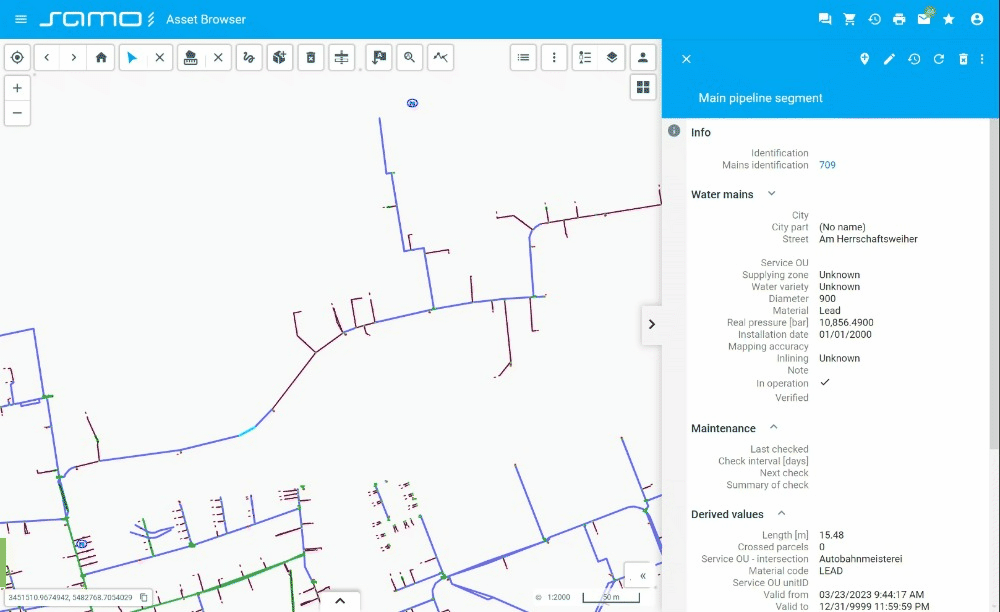
Place Attribute
sm-place-attribute: Manages or displays attributes of selected places or features.
"placeAttribute": {
  "type": "sm-place-attribute",
  "id": "placeAttribute",
  "types": {
    "ft_5012100": {
      "displayableAttributeTypeId": "ft_5012100_gtda_5012102"
    },
    "ft_e_cable_ex/ft_e_cable_ex1": {
      "displayableAttributeTypeId": "ft_e_cable_ex1_gtda_5012101"
    },
    "ft_e_cable_ex/ft_e_cable_ex2": {
      "displayableAttributeTypeId": "ft_e_cable_ex2_gtda_Id"
    }
  }
}
Show sample animation "Place attribute"
Plot Layout Print
sm-plot-layout-print: Manages printing of map layouts or plots.
"plotLayoutPrint": {
  "type": "sm-plot-layout-print",
  "id": "plotLayoutPrint",
  "tooltip": "Plot layout print",
  "mapImageQuality": {
    "enabled": true,
    "default": "low",
    "checkScaleFactor": true
  },
  "layouts": {
    "type": "setting",
    "values": [
      {
        "id": "id_1266"
      },
      {
        "id": "324363711059566"
      },
      {
        "id": "114441569655005664"
      }
    ]
  }
}
Plot layout setting limitations
Only single-page map layouts with following components are supported by Plot Layout Print:
- Map frame - supported with limitations
- When printing by Plot Layout Print, data is always interactively loaded from map
- for
loadData, onlysource="graphics"is supported - display model is not supported
- for
- Coordinate grid is not supported at all
- Map frame must be simple rectangle (4 vertices)
- When printing by Plot Layout Print, data is always interactively loaded from map
- Overview map frame
- Northarrow frame
- Scale frame - supported with limitations
- For ruler, only
style="fullFilled"is supported - For labels, only
position="down"is supported - Rotation of scale and labels
- For ruler, only
- Text frame
- Variable frame
- Rubberstamp frame - supported with limitations
- File definition by file variable is not supported
- Only png / bmp files are supported, ie.
format="bmp"
Minimum size of the components is also limited. Very small components can't be printed. The minimum component width and height depend on the defined paper size. Example for A3 paper:
- Minimum height 0.1 mm
- Minimum width 0.2 mm
Show sample animation "Plot layout print"
Print
sm-print: Provides basic map printing functionality.
"print":{
"layouts": {
"type": "manual",
"values": [
{
"width": 277,
"height": 170,
"format": "a4",
"label": "A4 - Landscape",
"orientation": "l"
},
{
"width": 190,
"height": 257,
"format": "a4",
"label": "A4 - Portrait",
"orientation": "p"
},
{
"width": 400,
"height": 257,
"format": "a3",
"label": "A3 - Landscape",
"orientation": "l"
},
{
"width": 277,
"height": 380,
"format": "a3",
"label": "A3 -Portrait",
"orientation": "p"
},
{
"width": 574,
"height": 380,
"format": "a2",
"label": "A2 - Landscape",
"orientation": "l"
},
{
"width": 400,
"height": 554,
"format": "a2",
"label": "A2 - Portrait",
"orientation": "p"
},
{
"width": 821,
"height": 554,
"format": "a1",
"label": "A1 - Landscape",
"orientation": "l"
},
{
"width": 574,
"height": 801,
"format": "a1",
"label": "A1 - Portrait",
"orientation": "p"
},
{
"width": 1169,
"height": 801,
"format": "a0",
"label": "A0 - Landscape",
"orientation": "l"
},
{
"width": 821,
"height": 1149,
"format": "a0",
"label": "A0 - Portrait",
"orientation": "p"
}
]
},
"scales": {
"type": "manual",
"values": [
250,
500,
1000,
2500,
5000,
10000,
25000,
50000,
100000,
250000,
500000,
1000000,
2500000
]
},
"rotations": {
"type": "manual",
"values": [
0,
45,
90,
135,
180
]
},
"format": [
{
"id": "PDF",
"label": "PDF",
"value": "PDF"
},
{
"id": "JPG",
"label": "JPG",
"value": "JPG"
},
{
"id": "PNG",
"label": "PNG",
"value": "PNG"
}
]
}
Show sample animation "Print"
Rotation
sm-rotation: Allows rotation of the map view.
"rotation": {
  "type": "sm-rotation",
  "id": "rotation"
}
Show sample animation "Rotation"
Search
sm-search: Google-like search functionality for searching features on the map.
"configuration":{
"search":{
"type": "sm-search",
"searchEntities": [
{
"featureType": "ft_taiAddrPoint",
"titleString": "{get:#at_taiBase_description}",
"subtitleString": "{get:#at_taiAddrPoint_strassenname}",
"searchProperty": "at_taiAddrPoint_strassenname",
"priority": {
"1": "^([^0-9]*)$",
"0": "\\d"
},
"resultsCount": {
"2": "\\d",
"4": "^([^0-9]*)$",
},
"aggregations": {
"field": "at_taiBase_description"
}
}
],
"highlighResult": true,
"minResolution": 0.1400000756
}
}
Show sample animation "Search"
Search Form
sm-search-form: Displays configurable search forms for querying and locating features on the map.
Each search-form json file can be referenced in search-form tools by name of files.
"searchForm":{
"type": "sm-search-form",
"icon": "samo-icons:list",
"searchForms":["note", "mainPipelineAddress"]
}
most important properties are "submit" and "form"
{
"title": "Notes",
"responseTitle": "Notes",
"icon": "samo-demo-icons-eam:catalogue",
"description": "notes inside water objects",
"submit": {
"action": {
"type": "feature-api",
"request": {
"types": {
"ft_5012100": {
"filter": {
"type": "wildcard",
"operator": "equal",
"query": "*{get:#note}*",
"operand": {
"type": "property",
"property": "at_5010006"
}
}
}
}
}
},
"showLayers": [
"cat_5010000"
],
"form": {
"module": {
"type": "component:dynamic-app/modules/forms/key-value-form",
"elements": [
{
"label": "Note",
"placeHolder": "text inside note",
"property": "note"
}
]
}
}
}
}
form is defined as standard dynamic app form with all posibilities
"form": {
"module": {
"type": "component:entity-modules/form/samo-entity-properties-form",
"entityType": "ft_5012100",
"propertyGroupId": "fmx_50121"
}
}
Submit actions configuration
Feature api request is defined as feature query request from new api with combination of template strings with form datacontext.
{
"action": {
"type": "feature-api",
"request": {
"types": {
"ft_5012100": {
"filter": {
"type": "wildcard",
"operator": "equal",
"query": "*{get:#note}*",
"operand": {
"type": "property",
"property": "at_5010006"
}
}
}
}
}
}
}
Bussines Service
"submit": {
"action": {
"type": "serviceAction",
"serviceGroup": "ap_iskn",
"service": "katastr",
"actionId": "vyhledejParcelu",
"responseProperty": "entities"
}
}
Show sample animation "Search form"
Search Text
sm-search-text: Implements text-based search within the map or its features.
"searchText": {
  "type": "sm-search-text"
}
Show sample animation "Search text"
Select
sm-select: Provides selection tools for selecting features on the map. Supports single click selection, rectangle selection, line selection, and polygon selection.
"select": {
  "type": "sm-select",
  "id": "select"
}
"select": {
  "type": "sm-select",
  "id": "select",
  "singleSelect": true
}
Selection modes available:
- Single select - click to select individual features
- Rectangle select - draw a rectangle to select multiple features
- Line select - draw a line to select features it crosses
- Polygon select - draw a polygon to select features within it
Show sample animation "Select"
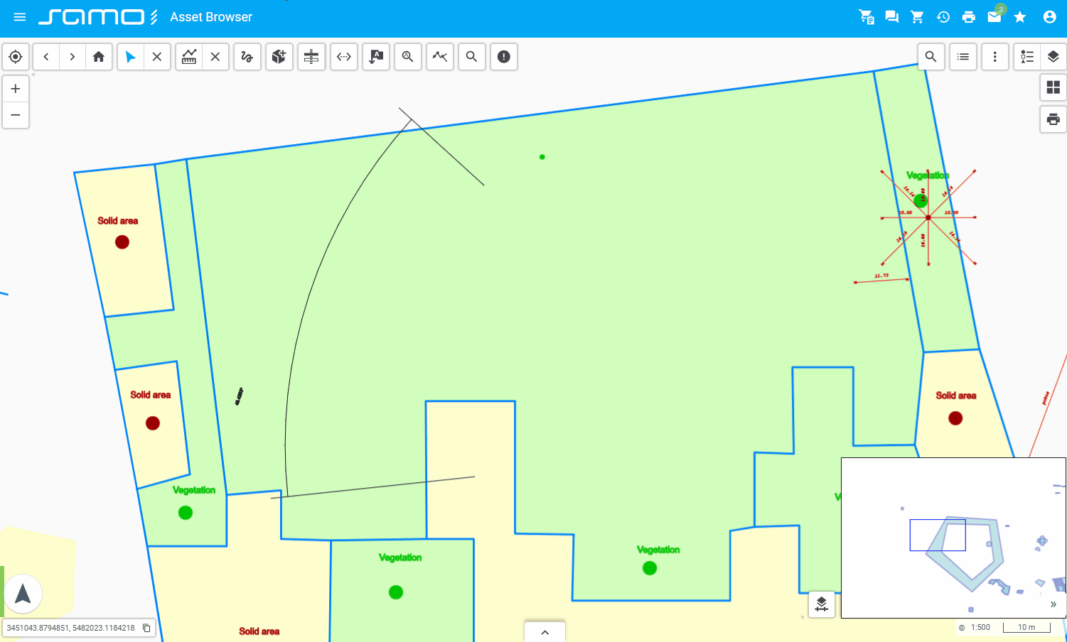
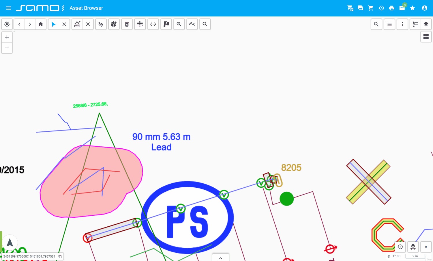
Simple Dimension
sm-simple-dimension: Provides simple dimensioning tools for measuring or annotating the map.
"simpleDimension": {
  "type": "sm-simple-dimension",
  "types": {
    "ft_simp_dimension": {
      "customLabel": {
        "enabled": true
      },
      "styleMap": {
        "ft_simp_dimension": {
          "masterGraphics": {
            "resources": {
              "fonts": ["sans-serif"]
            },
            "symbolizer": {
              "type": "Line",
              "color": "#FF0000",
              "strokeWidth": 1,
              "startPoint": {
                "symbolizer": {
                  "type": "Point",
                  "fontFamily": "sans-serif",
                  "charCode": 9654,
                  "symbolHeight": 1,
                  "rotation": 180,
                  "textAlign": "end",
                  "color": "#FF0000"
                }
              },
              "endPoint": {
                "symbolizer": {
                  "type": "Point",
                  "charCode": 9654,
                  "fontFamily": "sans-serif",
                  "symbolHeight": 1,
                  "textAlign": "end",
                  "color": "#FF0000"
                }
              }
            }
          }
        }
      }
    },
    "ft_5082000": {
      "mandatorySemantics": true,
      "customLabel": {
        "enabled": true
      }
    }
  },
  "layers": ["setdefinition_80425981052865018", "my-sketchings"]
}
Show sample animation "Simple dimension"
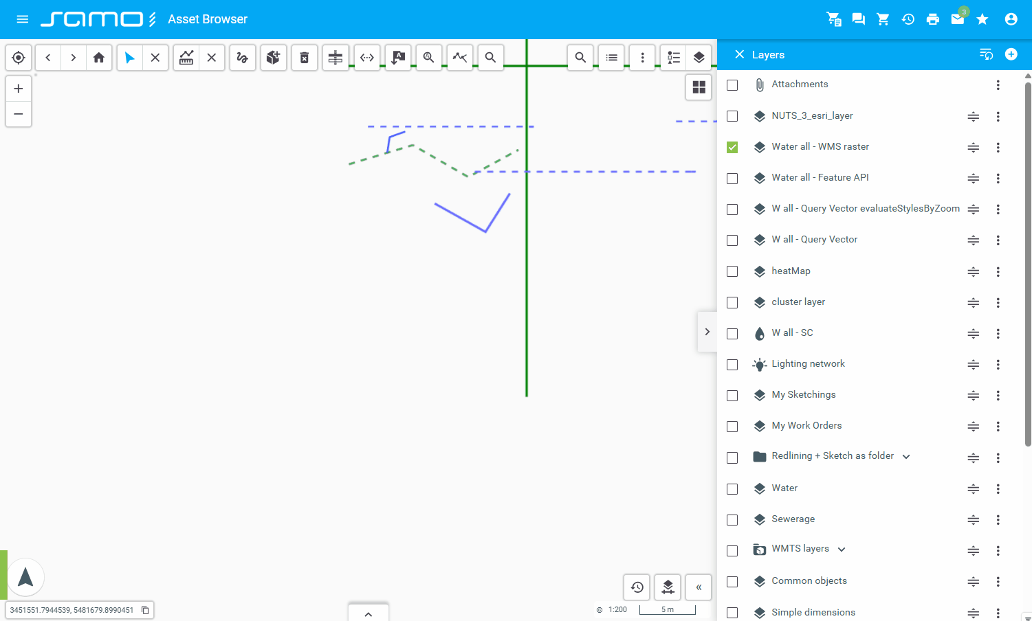
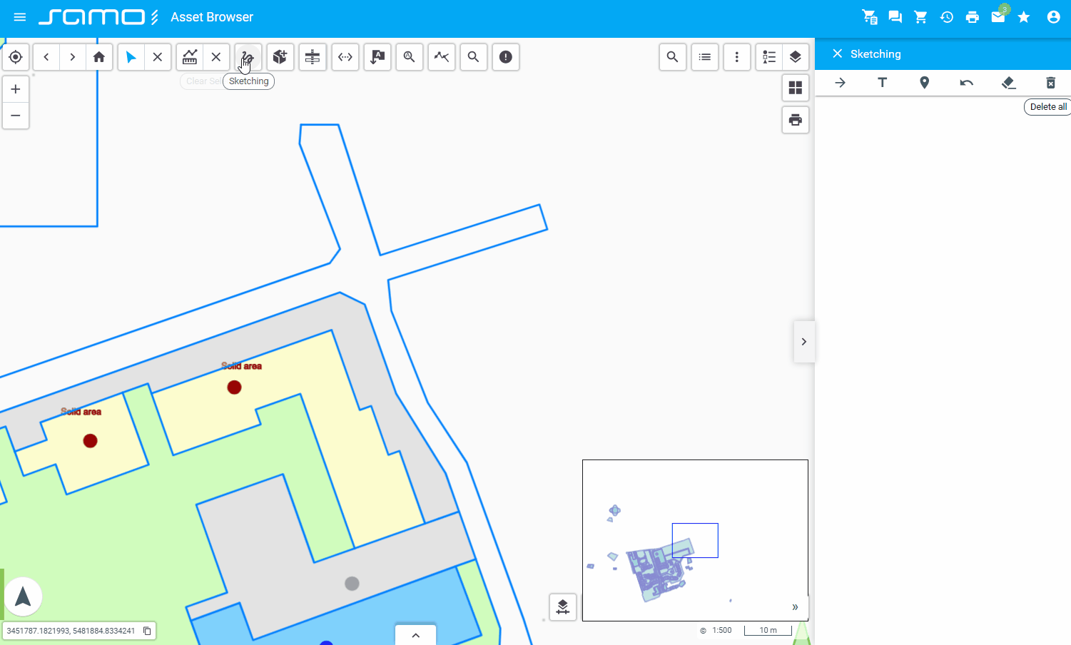
Sketching
sm-sketching: Enables freehand sketching or annotation on the map.
"sketching": {
  "type": "sm-sketching",
  "id": "sketching",
  "styleMap": {
    "strokeColor": "#FF0000",
    "fillColor": "#00FF00",
    "dashColor": "#FF00EE",
    "strokeWidth": 3,
    "dashWidth": 5,
    "strokeOpacity": 40,
    "fillOpacity": 50,
    "dashOpacity": 60,
    "text": {
      "fontSize": 22,
      "rotation": 180
    },
    "place": {
      "iconAnchor": [75, 150],
    }
  },
  "hideOptions": ["Polygon", "LineString"]
}
Show sample animation "Sketching"
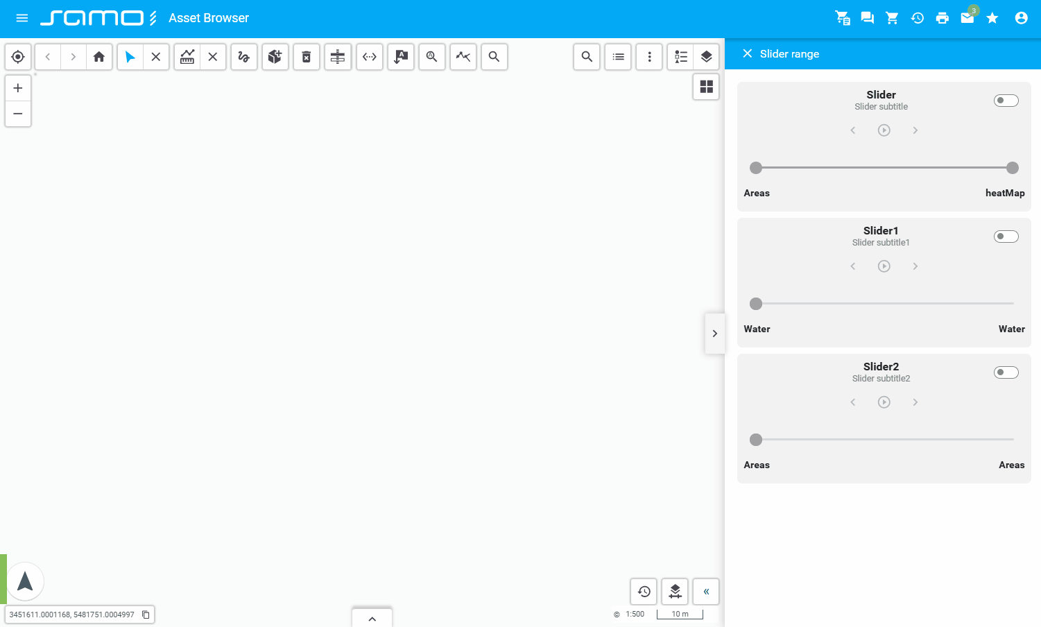
Slider
sm-slider: Provides slider controls for adjusting time, layers, or other parameters.
"slider": {
  "type": "sm-slider",
  "items": [
    {
      "type": "range",
      "sliderTitle": "Slider",
      "sliderSubtitle": "Slider subtitle",
      "layers": [
        "cat_5060000",
        "heatMap",
        "setdefinition_201105021258_ele-routes"
      ],
      "valueStart": 0,
      "valueEnd": 0,
      "step": 1,
      "playButtonIntervalTime": 2000,
      "enabled": true
    },
    {
      "type": "range",
      "sliderTitle": "Slider1",
      "sliderSubtitle": "Slider subtitle1",
      "layers": ["cat_5010000", "cluster"],
      "valueStart": 0,
      "valueEnd": 0,
      "step": 1,
      "playButtonIntervalTime": 2000,
      "enabled": false
    }
  ]
}
Show sample animation "Slider"
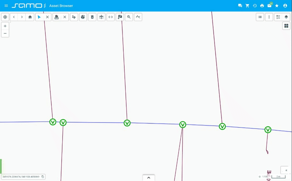
Topology Tracing
sm-topology-tracing: Enables tracing of topological relationships between map features.
"topologyTracing": {
  "type": "sm-topology-tracing",
  "options": [
    {
      "id": "tr_1",
      "title": "Unlimited-no stop conditions"
    },
    {
      "id": "tr_1a",
      "title": "Unlimited-without inner nodes",
      "featureTypes": ["ft_5011100"]
    }
  ]
}
Show sample animation "Topology tracing"
Zoom
sm-zoom-control: Provides zoom in and zoom out buttons for controlling the map zoom level.
"zoomControl": {
  "type": "sm-zoom-control",
  "id": "zoomControl"
}
Show sample animation "Zoom"