Changing the color theme
Level: Beginner
Keywords: color theme, primary-color, accent-color
The result: changed color theme for your SAMO project
WHY change the color theme?
Color theme for given SAMO project is mostly changed for reasons of adapting colorful look of the application close to the customer corporate design or based on other customer requirements.
HOW to change color theme?
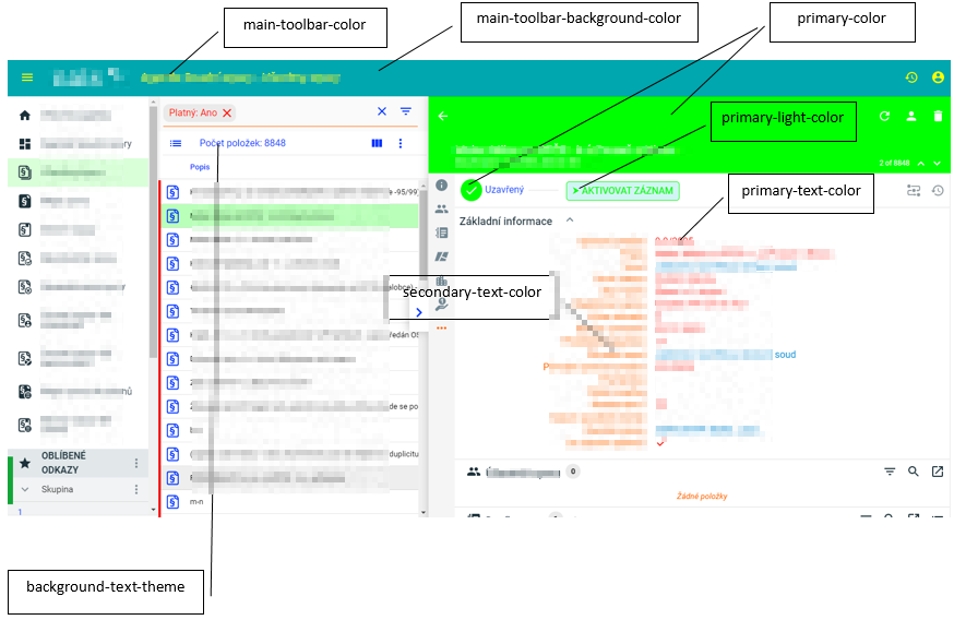
Color theme is defined in samo.js file, located typically in ..gateway\applications\applicationName\resources\themes folder. There are many predefined color theme parameters for default using in SAMO projects, see the table below.
If you want to change the color theme, the colors for certain parts of application, you must change values for parameters defined in CUSTOMIZATION PART section if samo.js file.
You should not change other parameters out of CUSTOMIZATION PART.
List of selected parameters and their meaning:
| color | usage |
|---|---|
| primary-color | affects the color of detail form header and action form header, selected item in menu and browse (with given opacity), text in action buttons |
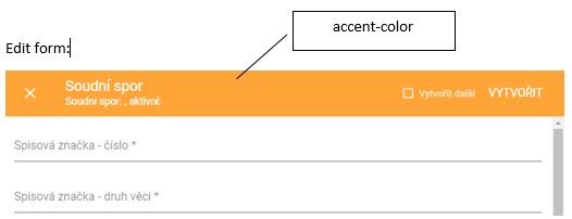
| accent-color | affects the color of edit detail header |
| main-toolbar-background-color | determines the background color in main toolbar |
| main-toolbar-color | determines the text and icon color in main toolbar |
| primary-text-color | affects the color of data items values in detail forms |
| secondary-text-color | affects the color of data items labels in detail forms |
| background-theme | affects the color of browse header |
| background-text-theme | affects the color of column labels in browse |
| primary-light-color | affects the background color of workflow buttons |
The values for listed parameters can be defined directly with using "rgba" or "hex" notation or with using of variable defined previously in the same file.
        /* CUSTOMIZATION PART */\
        --primary-light-color: rgba(210,244,245,1) !important;\
        --primary-light-color-text: var(--text-primary-light-color) !important;\
        --primary-color: rgba(0,167,174,1) !important;\
        --primary-color-text: var(--text-primary-dark-color) !important;\
        --primary-dark-color: var(--paper-light-blue-700) !important;\
        --primary-dark-color-text: var(--text-primary-dark-color) !important;\
    \
        --accent-light-color: var(--paper-light-green-100) !important;\
        --accent-light-color-text: var(--text-primary-light-color) !important;\
        --accent-color: rgba(255,165,56,1) !important;\
        --accent-color-text: var(--text-primary-dark-color) !important;\
        --accent-dark-color: var(--paper-light-green-700) !important;\
        --accent-dark-color-text: var(--text-primary-light-color) !important;\
    \
        --test: var(--paper-deep-orange-500) !important;\
        --error-color: var(--paper-deep-orange-500) !important;\
        --error-color-text: var(--text-primary-dark-color) !important;\
    \
        --paper-listbox-background-color: var(--background-card-theme);\
        --main-toolbar-background-color: rgba(0,167,174,1);\
        --main-toolbar-color: rgba(255,255,255,1);\