Samo-markdown-module
Level: Catalog
Keywords: markdown, formatted text, text section
The result: overview of samo-markdown-module configuration options
Samo-markdown-module enables adding formatted text wrapped in web module for example to your dashboard pages or as a detail section.
Markdown is a lightweight markup language with plain-text-formatting syntax. It is often used for readme files, or for example this whole Implementation Cookbook is written in it. This Cheat Sheet can be helpful to learn the basics of markdown syntax.
How to implement Samo-markdown-module?
There are two main ways of configuring this Samo-markdown-module, depending on the complexity of its text content. All configuration options can be found in the Dynamic-App Module Catalog.
1. Simple text content
In this case, you can include the text directly in the module configuration using content configuration parameter.
    {
        "module": {
            "type": "component:dynamic-app/modules/common/samo-markdown-module",
            "content" : "## Second level title \n [This](https://www.google.com/) text will be written on the **next line**."
        }
    }
2. Rich text content
You can imagine, that it would be hard to write more complex or rich text content similar as in the previous case. Therefore samo-markdown-module enables you to write the whole markup content in separate .md file and only refer to it in the module configuration using the contentResource configuration parameter. This option is used for example for SAMO User Guide content.
    {
        "module" : {
            "type"  : "component:dynamic-app/modules/common/samo-markdown-module",
            "contentResource" : "resource:help/userGuide_{lang:}.md"
        }
    }
Notice the _{lang:} string in the contentResource path. It enables you to load file written in the corresponding language, which is currently being used in the application. In the ..resources/help folder you will have multiple markdown files for each application language (e.g. userGuide_en.md, userGuide_de.md).
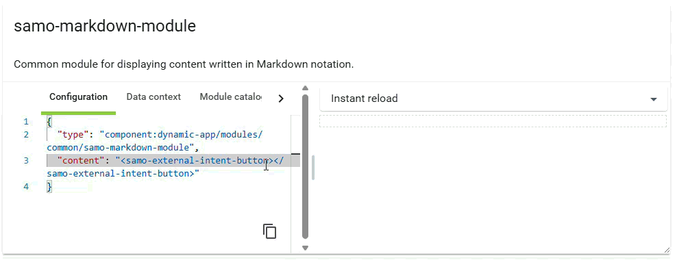
3. External intent button
Samo-markdown-module supports adding interactive buttons that can trigger intents directly from your markdown content. This is achieved using the special samo-external-intent-button component, which enables you to embed action buttons within your formatted text.
The button behaves exactly as a regular intent - it requires an intent configuration with a unique ID. This intent ID is then referenced by the external button to trigger the corresponding action.
    {
        "module": {
            "type": "component:dynamic-app/modules/common/samo-markdown-module",
            "content": "View your profile settings\n\n<samo-external-intent-button intent-id=\"openUserProfile\" label=\"Open Profile\"></samo-external-intent-button>"
        }
    }
Available properties
| Property | Description |
|---|---|
intent-id | (Required) ID of the intent to be triggered when the button is clicked |
label | Shows label text in the button |
icon | Shows icon in the button. When used without label, displays only the icon. When used with label, displays both icon and label |
tooltip | Adds a tooltip that appears on button hover |
outlined | Shows the outline of the button. Does not apply to icon-only buttons |
raised | Fills the button with color. Does not apply to icon-only buttons |
Show sample animation "External Intent Button"
Pay attention to the display configuration in your intent. If you define "detail" in the display property, the intent will be visible in both the detail header and as a button in the markdown. If you want the intent to be accessible only through the samo-external-intent-button (and not in the detail header or three-dot-menu), set display to an empty array []. The intent metadata remains functional and can still be called from the external button.
While it is possible to override the default styles of this button, it is recommended to keep the default styling. By default, the button inherits styles from your project's Theme, ensuring visual consistency across your application.