Overview of Form Modules
Level: Catalog
Keywords: entity editation form, properties, attributes, geometry
The result: help you to decide, which form module to choose
This chapter lists all web modules that can be included in the entity Editation form. We distinguish several types of these modules based on their function. There is always a configuration example below the chosen illustration of detail module. After clicking on the module's title a new tab will open with a link to the Dynamic-App Module Catalog, where you can find all configuration possibilities.
Entity information
This section describes modules used to display and edit entity properties (feature attributes). For common configuration possibilities (e.g. input validation or prefilling of data context) check Attributes Prefilling.
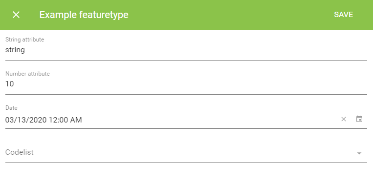
Samo-entity-properties-form
This is the most basic module usable in Editation forms. In its default configuration it loads the default Lids form of entity from the LIDS model.xml. You can specify a different Lids form to be loaded by using propertyGroupId parameter. There are also other available configuration options, which enable you to redefine (overrideProperties), hide (hideProperties), or sort (sortProperties) the default Lids form items.
    {
        "edit" : {
            "default" : {
                "sections" : [
                    {
                        "module": {
                        "type": "component:entity-modules/form/samo-entity-properties-form",
                        "propertyGroupId" : "fmd_example"
                        }
                    }
                ]
            }
        }
    }
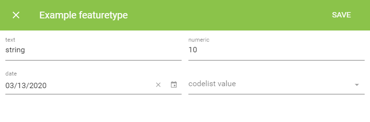
Key-value-form
This second module does not differ from the first one visually, however works on a different principle. Key-value-form brings possibility to define custom Edit form in SAMO metadata, with possibility to reference entity attributes defined in model.xml. The elements array determines the order, type and behavior of inputs.
There are two basic element inputs: standard (e.g. text, numeric, datetime, codelist, markdown or recapcha) and entity (e.g. attachments, bounded codelists or entity list pickers). You can find more about their configuration possibilities in Dynamic-App Module Catalog.
Not all of the entity input elements are designed to be used in Edit forms. Some of them were intended for Action forms. Although there is a little visual difference between these two kinds of forms, they provide different functionality, work on different principles and therefore cannot ensure a correct behavior of every entity input element.
    {
        "edit" : {
            "default" : {
                "sections" : [
                {
                    "module" : {
                        "type" : "component:dynamic-app/modules/forms/key-value-form",
                        "elements" : [
                            {
                                "type" : "text",
                                "label" : "text",
                                "property" : "at_example_string"
                            },
                            {
                                "type" : "numeric",
                                "label" : "numeric",
                                "property" : "at_example_number"
                            },
                            {
                                "type" : "date",
                                "label" : "date",
                                "property" : "at_example_date"
                            },
                            {
                                "type" : "codelist",
                                "label" : "codelist value",
                                "property" : "at_example_cl_stateExample",
                                "codelist" : "cl_stateExample",
                                "titleProperty" : "ca_stateExample_desc",
                                "idProperty" : "ca_stateExample_id"
                            }
                        ]
                    }
                ]
            }
        }
    }
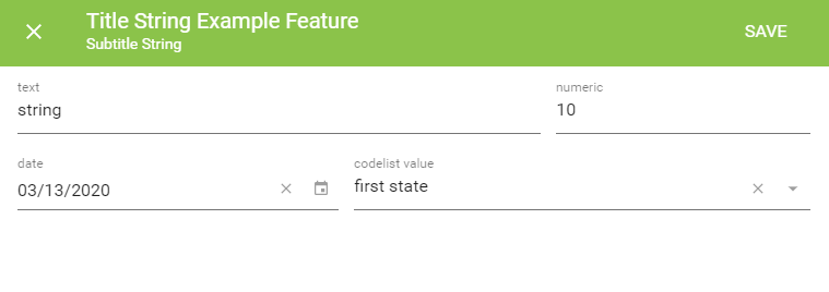
Key-value-grid-form
This module is DEPRECATED
Key-value-grid-form provides the same functionality and configuration options as the key-value-form. Additionally, it provides option to group chosen input elements, put multiple elements on the same row, or create a multi-column layout. Since SAMO Platform version 6.9.1 this module became deprecated and was replaced by Samo-grid-form.
    {
        "edit" : {
            "default" : {
                "sections" : [
                    {
                        "module" : {
                            "type" : "component:dynamic-app/modules/forms/key-value-grid-form",
                            "rows" : [
                                {
                                    "elements" : [
                                        {
                                            "type" : "text",
                                            "label" : "text",
                                            "property" : "at_example_string"
                                        },
                                        {
                                            "type" : "numeric",
                                            "label" : "numeric",
                                            "property" : "at_example_number"
                                        }
                                    ]
                                },
                                {
                                    "elements" : [
                                        {
                                            "type" : "date",
                                            "label" : "date",
                                            "property" : "at_example_date"
                                        },
                                        {
                                            "type" : "codelist",
                                            "label" : "codelist value",
                                            "property" : "at_example_cl_stateExample",
                                            "codelist" : "cl_stateExample",
                                            "titleProperty" : "ca_stateExample_desc",
                                            "idProperty" : "ca_stateExample_id"
                                        }
                                    ]
                                }
                            ]
                        }
                    }
                ]
            }
        }
    }
Samo-grid-form
This new module enables better support of groups with titles and better width support. This module deprecates the Key-value-grid-form.
Others
This section describes modules used to display and edit additional entity properties (e.g. geometry), or to provide additional functionality.
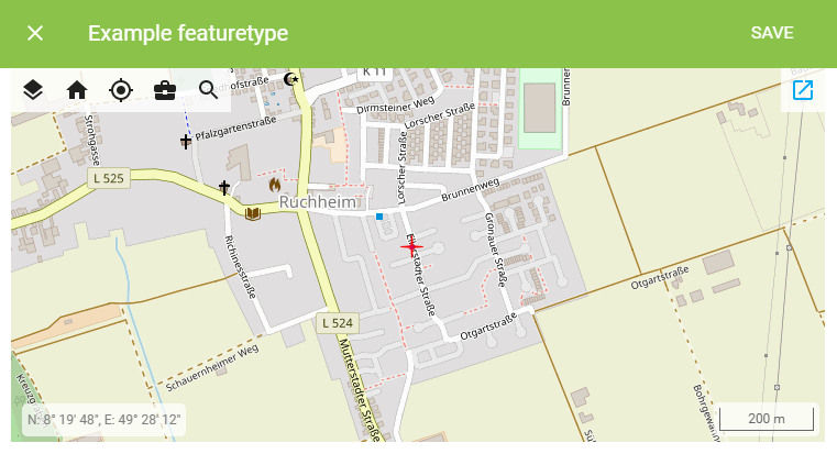
Samo-position-edit
Samo-position-edit module is used for creating and editing entity's geometry. It extends the configuration of samo-map. The module supports all basic geometry types (points, lines, polygons) through drawType configuration and multiple editation options.
    {
        "edit" : {
            "default" : {
                "sections" : [
                    {
                        "module" : {
                            "type" : "component:map-modules/form/samo-position-edit",
                            "map" : {
                                "extends" : "default",
                                "enabledLayers": [
                                    "baseOSM"
                                ]
                            },
                            "drawType" : "Point"
                        }
                    }
                ]
            }
        }
    }
Samo-tai-form
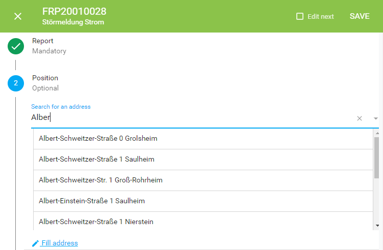
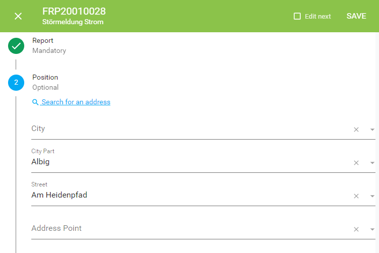
Samo-tai-form module is used for inputting address. It enables two modes - a single line input with suggestions and multiple line input where you can fill in street, city and other address items separately. This module requires running Samo-tai-server.
        "module": {
            "type": "component:entity-modules/tai/samo-tai-form",
            "tenant": "eam",
            "formFields": [
                {
                    "id": "city",
                    "label": "{tr:modelAttributes.taiCity}",
                    "attrs": {
                        "at_boOprBase_cl_taiCity": {
                            "id": "ca_taiCity_id",
                            "value": "ca_taiCity_description"
                        }
                    }
                },
                {
                    "id": "cityPart",
                    "label": "{tr:modelAttributes.taiCityPart}",
                    "attrs": {
                        "at_boOprBase_cl_taiCityPart": {
                            "id": "ca_taiCityPart_id",
                            "value": "ca_taiCityPart_description"
                        }
                    }
                },
                {
                    "id": "street",
                    "label": "{tr:modelAttributes.taiStreet}",
                    "attrs": {
                        "at_boOprBase_cl_taiStreet": {
                            "id": "ca_taiStreet_id",
                            "value": "ca_taiStreet_description"
                        }
                    }
                },
                {
                    "id": "point",
                    "label": "{tr:modelAttributes.taiAddrPoint}",
                    "attrs": {
                        "at_boOprBase_cl_taiHouseNoAdd": {
                            "id": "ca_taiAddrPoint_id",
                            "value": "ca_taiAddrPoint_description"
                        }
                    }
                }
            ]
        }
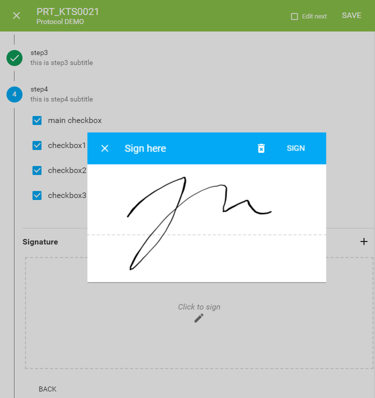
Samo-signature-input
Samo-signature-input is used for signing e.g. documents and protocols. The signature is saved in the attribute and afterwards visualize it in e.g. samo-markdown-module, or generated documents from templates.
In case of protocols, you can store the signature directly in the protocol content attribute so you don't need to define attribute in the LIDS model.xml. If you don't want to use it and you define attribute in model.xml, use <ber:string maxLength="10000"/> data type.
    {
        "overrideProperties": {
            "at_signature": {
                "type": "signature",
                "validation": {
                    "required": true,
                    "errorMessage": "{tr:required}",
                    "validateOnChange": true
                }
            }
        }
    }
    {
        "module": {
            "type": "component:dynamic-app/components/input/samo-signature-input",
            "title": "Signature",
            "property": "at_boProtocol_content.data.signature",
            "validation": {
                "required": true,
                "errorMessage": "{tr:required}",
                "validateOnChange": true
            }
        }
    }
{
"module": {
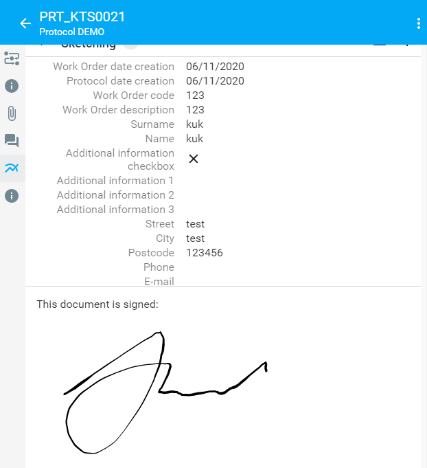
"type": "component:dynamic-app/modules/common/samo-markdown-module",
"content": "This document is signed:<br><img src=\"{get:#at_boProtocol_content.data.signature}\">"
}
}