Common Detail Configuration Options
Level: Catalog
Keywords: detail size, layout, sections, header, Big Detail
The result: Overview of common detail configuration options.
All details have some common configuration options, which are assessed in this chapter. This is an extension (additional guide) to all possible configuration options which can be found in Dynamic-App Module Catalog
Context
There is a possibility to define multiple details for the same entity, which are shown in different situations (different contexts). Each entity should have detail with default context, details in additional contexts are optional. Which detail context should be used in a specific situation is defined in other DA components (e.g. SAMO Browse, related entity sections, planning board), which load the context content from the detail configuration.
Size
You can configure the width of the detail on the initialization. By default, the detail is 30 % of the screen wide. This size is set in the SAMO Browse configuration. There are two configuration parameters:
"wideDetail" : trueinitializes detail, that is 60 % of the screen wide"fullscreenDetail" : trueinitializes detail, that is 100 % of the screen wide (used in agend systems, with Samo-stepper-module)
The width of the detail is always at least 375 px.
Responsiveness
User can always change the width of the detail by dragging the side of the detail and stretching or pulling it. The layout of sections reacts to this change and it is possible to override the default behavior.
Sections in the detail can be displayed either in flat mode or in grid. You can configure the width of the detail, from which the detail should be displayed as flat, if the current width will be greater, the detail will display in the grid mode. This option takes into account the current width after the user customization.
| flatSize enum | absolute width (upper limit) |
|---|---|
none | 0 px |
xs | 400 px |
s | 600 px |
m | 1000 px |
l | 1400 px |
xl | infinity |
Header
Header is the uppermost part of the detail, which contains Title, Subtitle and intent icons. It may also contain web modules, such as samo-entity-workflow, which will be displayed as a fixed row with white background.
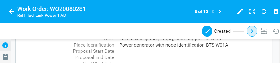
Fig. 1 Detail header
By default, the size of the header changes according to the flatSize of the detail. In the m flatSize it becames always narrow. Regarding the s flatSize, there are currently two options.
-
A narrower header with main color from your application theme - the default
-
A wider header with background image
Either you need to add titleImage to your entity configuration:
    {
        "extends": "ft_defBoDefect",
        "title": "{tr:defects.defectWater}",
        "titleImage": "images/entities/headerImage.jpg"
    }
OR you can use backgroundImage property in the header object:
    {
        "default" : {
            "header": {
                "backgroundImage": "images/entities/headerImage.jpg",
                "module": {
                    "type": "component:entity-modules/detail/samo-entity-header"
                }
            },
            "sections": [
                {}
            ]
        }
    }
This configuration will override the tileImage configuration, therefore it is possible to use different pictures for different detail contexts.
Sections
All common configuration options available for sections can be found in Dynamic-App Module Catalog. Most of the configurations are straightforward and do not require further explanation.
Layout
It is possible to influence the order of the detail sections and layout for each flatSize of the detail. The layout can be simple (one column) or gridded (multiple columns). The grid layout configuration was formerly known as Big Detail. We can also split the content into multiple tabs.
Order
The order of the sections is given by their order in the configuration, as the sections configuration parameter is of type array.
Grid
The grid layout (as columns in a row) of sections is configured using the width configuration parameter. The width parameter works with the Bootstrap Grid System. The detail content is split to 12 equal columns and you can specify for each section, how many columns it should cover.
If you want, for example, to display sections since the l flatSize in three columns and since m flatSize in two columns, you need to use following configuration.
      "sections": [
        {
            "width": {
                "m": 6,
                "l": 4
            },
            "module": {
                "title" : "Activity log",
                ...
            }
        },
        {
            "width": {
                "m": 6,
                "l" : 4
            },
            "module": {
                "title" : "Address",
                ...
            }
        },
        {
            "width": {
                "m": 6,
                "l" : 4
            },
            "module": {
                "title" : "Notes",
                ...
            }
        }
      ]
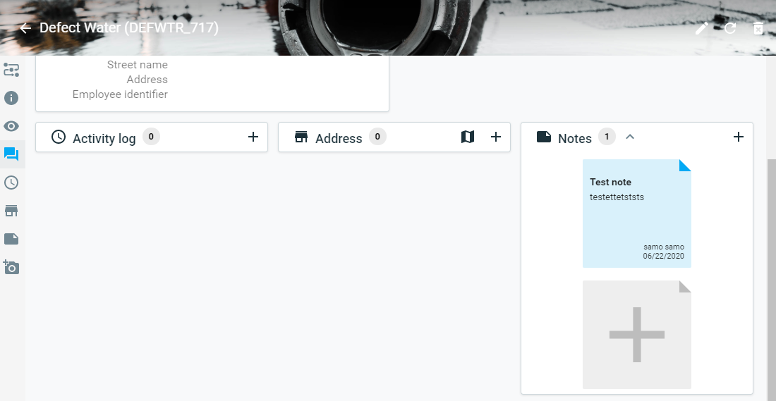
Fig. 2 Three column detail grid layout in flatSize: l
Fig. 3 Two column detail grid layout in flatSize: m
If you want to create layout where there are multiple sections below each other and only one section in the second column, you need to use following configuration.
          "sections": [
        {
            "width": {
                "m": 6
            },
            "module": {
                "title" : "Info",
                ...
            }
        },
        {
            "width": {
                "m": 6
            },
            "sections" : [
                {
                    "width" : {
                        "m" : 6
                    },
                    "module": {
                        "title" : "Subscriptions",
                        ...
                    }
                },
                {
                    "width": {
                        "m": 6
                    },
                    "module": {
                        "title" : "Comments",
                        ...
                    }
                }
            ]
        }
      ]
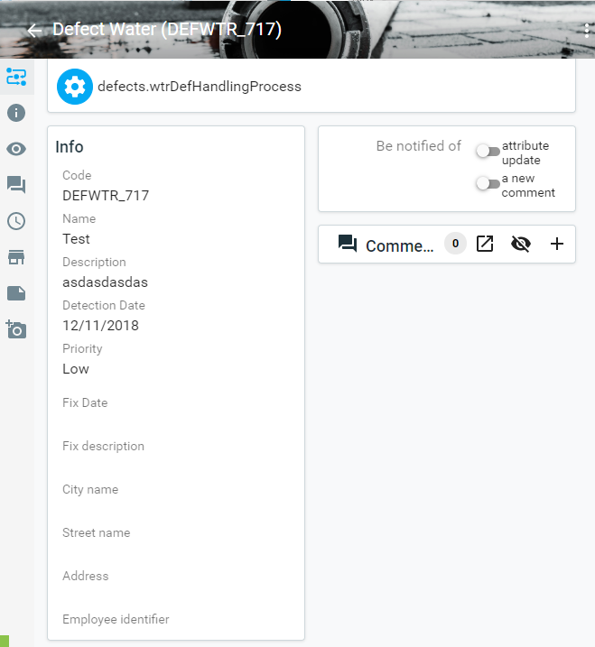
Fig. 4 Two rows detail grid layout in flatSize: m
Tabs
In entity detail configuration, tabs can be configured to divide sections in Info detail into separate tabs. Tabs are configured as arrays of objects with title and sections.
    {
        "tabs": [
            {
                "title": "Overview",
                "sections": [
                    {
                        "title": "{tr:info}",
                        "icon": "icons:info",
                        "width": {
                            "m": 6
                        },
                        "module": {
                            "type": "component:entity-modules/detail/samo-entity-properties-detail",
                            "title": "{tr:info}"
                        }
                    }
                ]
            },
            {
                "title" : "Assigned Assets",
                "sections" : []
            }
        ]
    }
See, that for the flatSize: s the workflow defined in header is displayed as the first detail section, however in the flatSize: m it is present in the tab bar.
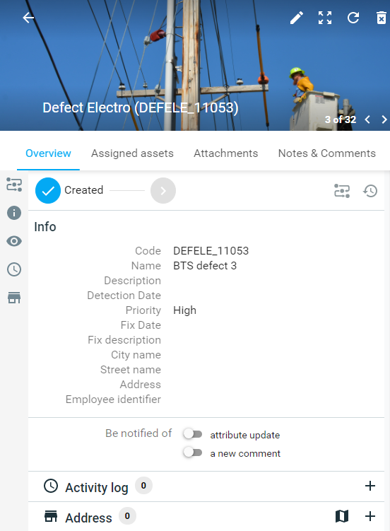
Fig. 5 Info detail with tabs in flatSize: s
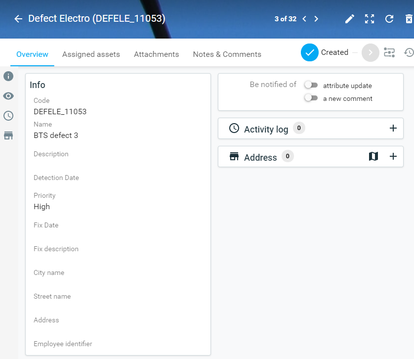
Fig. 6 Info detail with tabs in flatSize: m